Dead Cat Bounce or Real Rally?
Investors are split on whether the rally since late-March is the real-deal or a short-lived bounce. Here’s what our quant experts are saying
Is this market rally a “dead cat bounce” (also known as a “bear market rally”), or is it a sustained recovery?
Well, if it’s a dead cat bounce, it’s the highest bounce ever.
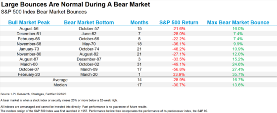
Below is a chart highlighting the largest bear-market bounces of all time.
If you have trouble reading it, as of yesterday morning, the S&P had bounced 35.7% since its late-March low — putting this bounce at number-one on the list.
For context, the next largest bear market bounce was back during the Financial Crisis, when the S&P bounced 27.4%.

Source: Ryan Detrick/LPL Research
So, what gives? Is this just a bear market rally or is it a real recovery?
Our technical experts, John Jagerson and Wade Hansen, offered their two-cents in their Strategic Trader update this past Wednesday:
When the S&P 500 hit its low on March 23 and started to rebound, traders around the world were wondering if the move was the beginning of a new bullish uptrend or just a “dead cat bounce” — where stocks would rise for a little bit, get everyone’s hopes up and then turn right back around and resume their downtrend.
We have confirmed the bullish rebound we’ve been experiencing for the past two months is not a “dead cat bounce.”
But how much longer are stocks likely to continue moving higher?
It’s the last question that really matters.
Whatever you call the market surge that’s occurred since late March, the more pressing issue is “what’s next?”
So, in today’s Digest, let’s see what our technical experts are saying. Spoiler alert — bears who have been waiting for this rally to collapse may grow even more disappointed as the summer heats up.
***Where the market is headed according to one of John’s and Wade’s favorite relative strength charts
In their newsletter, Strategic Trader, John and Wade combine fundamental and technical analysis, along with historical market data, to profitably trade options even during times of massive volatility.
As part of this, they track various macroeconomic indicators. One that helps them gauge whether bullish sentiment is getting stronger or is starting to fade compares two sectors: consumer discretionary and consumer staples.
“Consumer discretionary” represents companies like Amazon and Home Depot. These companies do better when consumers have extra money to spend and feel confident that their financial future will continue to be strong.
“Consumer staples” represents companies like Procter & Gamble and Walmart. These companies tend to do well even during economic slowdowns. That’s because people still need to buy basic items to live (shampoo, toothpaste) despite a souring economy.
John and Wade explain that these sectors tend to overperform and underperform at certain points in the overall business cycle:
Consumer discretionary stocks typically start to outperform near the bottom of the business cycle when the economy is shifting from its contraction to its expansion phase.
Consumer staples stocks typically start to outperform near the top of the business cycle when the economy is shifting from its expansion phase to its contraction phase.
***The simplest way to make this comparison is by creating a relative-strength chart of the Consumer Discretionary Select Sector SPDR Fund (XLY) and the Consumer Staples Select Sector SPDR Fund (XLP)
When the XLY/XLP relative-strength chart is moving higher, it tells you that XLY is outperforming XLP and the S&P 500 is likely going to be doing well.
When the opposite is true, it suggests bearish pressure on the S&P.
Let’s return to John and Wade for what this indicator is revealing today:
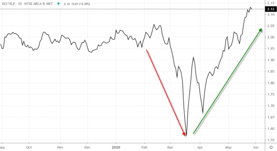
You can see in the XLY/XLP relative-strength chart in Fig. 2 just how dramatically sentiment shifted after the S&P 500 reached its low on March 23.

Fig. 2 — XLY/XLP Daily Relative-Strength Chart — Chart Source: TradingView
The bullish turnaround in sentiment was swift and dramatic.
Perhaps the most encouraging is the fact that the bullish trend of the XLY/XLP seems to be accelerating.
Look for the XLY/XLP chart to continue moving higher as we head into the summer.
By the way, if you’re wondering how this indicator holds up during unusual market conditions like those we’re living through today, John and Wade write that this method is especially useful during this period of high unemployment and pessimistic consumer sentiment.
***There’s a second indicator John and Wade monitor that is also bullish
When measuring trader sentiment, most investors tend to focus on the CBOE S&P 500 Volatility Index — the VIX. It’s a measurement of the anticipated volatility being priced into S&P 500 options for the next 30 days.
But we can also look beyond 30 days. When traders want a longer-term outlook, they can reference the CBOE S&P 500 3-Month Volatility Index — VIX3M.
As its name suggest, it’s a measurement of the anticipated volatility being priced into S&P 500 options for a three-month time frame.
Here’s John and Wade for more:
Because these volatility indexes measure the magnitude of the price movement traders believe the S&P 500 may make during the measured time frame, the value of the VIX3M is usually higher than the value of the VIX.
After all, if you give the market three months to make a move — like the VIX3M measures — instead of just one month — like the VIX measures — it has a greater chance of making a larger move.
Interestingly, there are times when traders will price in a greater chance of a larger move in the short term than in the long term because they are nervous the market is about to drop. This pushes the value of the VIX up higher than the value of the VIX3M.
To examine this relationship, John and Wade created a relative-strength chart of the indexes that divides the value of the VIX by the value of the VIX3M.
Most times, this chart will have a value less than “1.” That’s because the value of the VIX is usually less than the value of the VIX3M.
But during times of fear and market volatility, this reading will be greater than “1” because traders are more fearful about the next 30 days than three months out.
Where are we now?
Back to John and Wade:
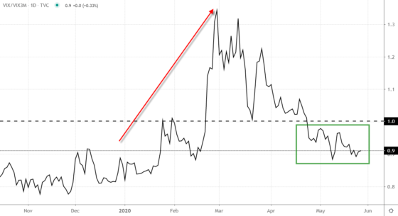
According to Fig. 3, after soaring to a recent high of 1.3 on Feb. 28, the VIX/VIX3M has once again dropped below one.

Fig. 3 — VIX/VIX3M Daily Relative-Strength Chart — Chart Source: TradingView
The chart hasn’t dropped as low as it was in late 2019, but it is trending lower.
And regular readers will recall the consistently elevated levels of early March. There was definitely more short-term volatility being priced into the market, but as we noted then, such high volatility is hard to sustain.
The recent readings on the VIX/VIX3M tell us trader sentiment is becoming increasingly bullish. Traders are becoming less and less worried we may encounter a dramatic bearish pullback in the near term.
***The bottom line today
Two of John’s and Wade’s favorite indicators are suggesting more gains are likely in the near future. Now, personally, I still scratch my head at the disconnect between Main Street and Wall Street. But one thing I learned years ago is that demanding a logical explanation for the market’s ups-and-downs is a fool’s errand.
What matters far more is how we respond to whatever the market offers us — whether it fits our investment-narrative or not. And today, the market is still in rally mode.
Back to John and Wade for their bottom line:
Looking at the uptrend of the XLY/XLP relative-strength chart in Fig. 2 and the downtrend in the VIX/VIX3M relative-strength chart in Fig. 3, we can see that trader sentiment is decidedly bullish at the moment.
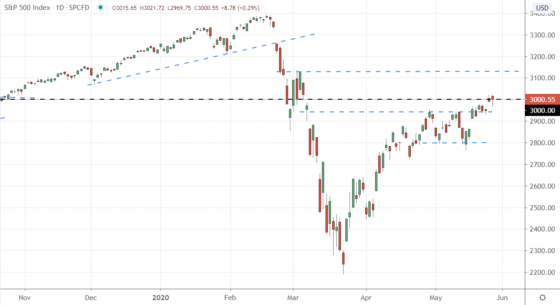
This tells us that if the S&P 500 can close above 3,000, it has a great chance of climbing up to its next resistance level at 3,130 (see Fig. 4).

Fig. 4 — Daily Chart of the S&P 500 (SPX) — Chart Source: TradingView
Since John’s and Wade’s update, the S&P has gone on to close above 3,000. As I write, it’s trading at 3,011 meaning the next resistance level is about 4% higher.
Dead cat bounce or not, momentum favors the bulls … for now.
Have a good evening,
Jeff Remsburg