Why The S&P 500 Rebounded And Why It (Maybe) Makes Sense
by Eric BasmajianSummary
- True corporate profits have stagnated since 2012, clouded by lower tax rates, and share buybacks.
- Lower interest rates are not a justification for higher valuations if the lower interest rates signal weaker profit growth.
- Two valuation methods pin a "fair" value for the S&P 500 around 2,200. One valuation measure suggests "fair" value is closer to 2,800, but several optimistic assumptions must hold.
- The most recent stock market correction was over in a flash. We are now better equipped to react to market declines and to understand the risks associated with a continued increase in risk assets.
- At 2,900 on the S&P, the market is expensive relative to profits. My strategy dictates an allocation to stocks is always a must, but an underweight position is most prudent.
The S&P 500 crashed 34% into the March 23rd low before rallying an equal 34% in the opposite direction, sitting at roughly 2,970 as of this writing. With so much economic devastation, including the worst GDP and retail sales figures on record, the crash makes sense, but the rebound is puzzling.
In this note, we take a close look at long-term trends in corporate profits and use our economic outlook to determine future profit potential. Lower interest rates are often used as a justification for the rally in stock prices, but does this logic hold when profit growth has stagnated?
Furthermore, using several valuation methods, we arrive at a "fair" value estimate for the S&P 500 and use assumptions to explain what is "priced-in" to the market at the current level of 2,900+. The current price does make sense when certain assumptions are used; the question is whether those assumptions will hold in the coming years.
When thinking about valuations and asset allocation, too often we see an "all or none" mentally. Below the fair value line implies investors should be fully invested while slight overvaluations lead investors to sell all risk assets, waiting for years to return to the market.
I use valuations as one part of the asset allocation process, starting with a balanced portfolio, including stocks, bonds, commodities, and gold. It is imperative that each investor carefully select a benchmark or baseline allocation that works for their personal situation. Without a benchmark, it is impossible to know whether you are underweight or overweight a certain asset class.
To me, overvaluations simply mean that I do not have a large margin of safety for the given risks. The amount of risk on the horizon is determined by the economic outlook, frequently discussed in weekly writings at EPB Macro Research. When risks are high, or economic growth is fragile, it is even more important to be aware of the valuation or margin of safety in the stock market. An overvalued market certainly does not justify zero exposure to risk assets, but at the very least, an investor should be mindful of the risks associated with an overweight allocation.
When risks are high, and markets are what I consider to be "overvalued," I simply underweight my exposure to risk assets, relative to my benchmark.
Given the economic trends that are likely to persist over the coming years, coupled with valuations that offer a very small margin of safety, I continue to hold exposure to stocks, but at a level that is underweight relative to my "all-weather" portfolio baseline.
Corporate Profit Tends & Valuations
The National Income and Product Accounts "NIPA" report various measures of corporate profits for the entire economy, which are far more reliable than non-GAAP S&P 500 profits, particularly when analyzing true growth trends.
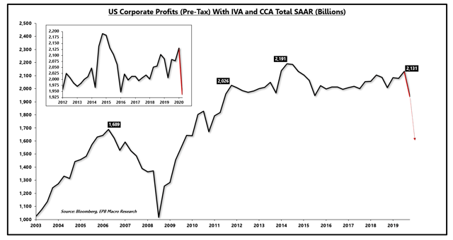
It is important to differentiate whether you are paying for true profit growth, or for financial engineering. The chart below shows the level of corporate profits for the entire US economy, reported before taxes.
As the zoomed chart in the upper left highlights, since 2012, corporate profits have stagnated as the real economy struggled to exceed 2% real growth.
Corporate profits from the NIPA are delayed, with the latest figures for Q4 2019, but the red line implies Q1 2020 results based on a constant ratio of profits to GDP.
Q2 2020 will show a massive drop in profits as well, potentially knocking profits near the peak before the 2008 recession.
Even prior to the current decline, corporate profits only grew roughly 26% relative to the peak in 2006, a level of profit growth that certainly is not worth a premium valuation, regardless of interest rates.
US Corporate Profits (Pre-Tax) With Inventory & Capital Consumption Adjustments:
Source: Bloomberg, EPB Macro Research
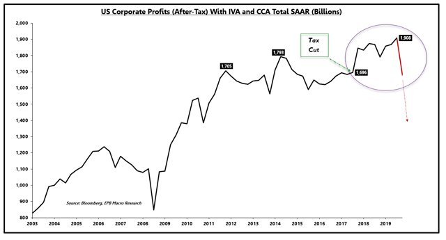
As the tax code was easier to exploit, after-tax corporate profits showed slightly more meaningful growth since the 2006 peak, but once again stagnated from 2012 through 2017, falling about 1% in that period.
In 2018, after-tax profits jumped, thanks to the newly passed corporate tax cut.
US Corporate Profits (After-Tax) With Inventory & Capital Consumption Adjustments:
Source: Bloomberg, EPB Macro Research
As the first two charts show, corporate profit growth has been anemic since 2012, with virtually all gains post-2018 coming from a lowering of the corporate tax rate.
These are simply facts worth considering when deciding how much of a margin of safety you require when making an allocation decision.
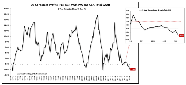
If we look at a long-term chart of pre-tax corporate profits on a 5-year annualized growth rate basis, we can see that profit growth was severely diminished well before the current recession.
As shown on the pop-out image, corporate profit growth was below 2% for the last five years, below the rate of total economic growth thanks to falling margins, pictured next.
US Corporate Profits (Pre-Tax) With Inventory & Capital Consumption Adjustments 5-Year Annualized Growth Rate (%):
Source: Bloomberg, EPB Macro Research
These measures are aggregate indicators for the entire US economy that encompass far more corporations than the most popular 500 publicly listed securities.
Ultimately, the underlying growth rate of the average public or private company will equal the measures above and below. Select companies or sectors such as technology may deviate from the average, but the trends presented are vital to understand, particularly when assessing the valuation of a broad index of companies, perhaps even broader than the S&P 500.
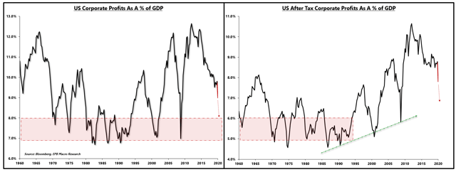
Corporate profits were growing more slowly than the broad economy because corporate margins were declining on average, before the non-GAAP adjustments presented in S&P 500 financial statements.
On the left, we can see pre-tax corporate margins and on the right, after-tax corporate margins, proxied by corporate profits expressed as a percentage of GDP.
Using pre-tax corporate profits is most useful for long-term analysis as the measure negates the changing corporate tax code.
The chart of pre-tax corporate profit margins shows a repeatable pattern, peaking near 11%-12% and bottoming very consistently near 7%.
After-tax corporate profits, however, have shown ever-increasing margins as the corporate tax code has changed in favor of lower taxes over time, with looser rules as it pertains to loopholes.
We will circle back to lower corporate tax rates in the final analysis.
US Corporate Profits As A % Of GDP (Corporate Margins):
Source: Bloomberg, EPB Macro Research
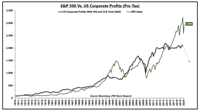
The stock market has a long history of tracking corporate profits. When the broad stock market trades at levels that deviate from corporate profits, a variety of explanations surface, most recently the argument that concludes that Federal Reserve QE can overpower profits.
There have been periods of time (the late 1990s) in which the stock market exceeded levels that were justified by profits. From 2009 through 2014, Federal Reserve QE was highly prevalent with a market that was trading relatively in line with profit growth. From 2014 through 2019, Federal Reserve QE was non-existent, and balance sheet contraction was occurring. Despite this reality, stock prices soared to levels that clearly deviate from broad economic profits.
US Corporate Profits Vs. S&P 500:
Source: Bloomberg, EPB Macro Research
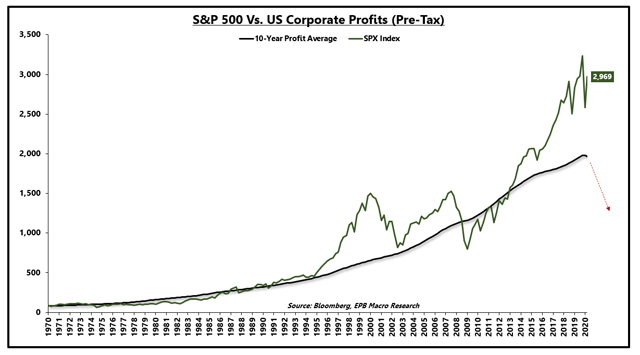
Similar to the Shiller PE ratio or the "cyclically adjusted earnings ratio," I find using a 10-year average of corporate profits smooths the volatility and presents a clear picture of profits relative to the broad stock market.
In my analysis, changing corporate tax rates, looser regulations as it pertains to corporate loopholes and the proliferation of technology companies exploiting user-data are more logical explanations for the deviation in the broad market above profits, rather than selectively choosing periods of Federal Reserve QE.
US Corporate Profits 10-Year Average Vs. S&P 500:
Source: Bloomberg, EPB Macro Research
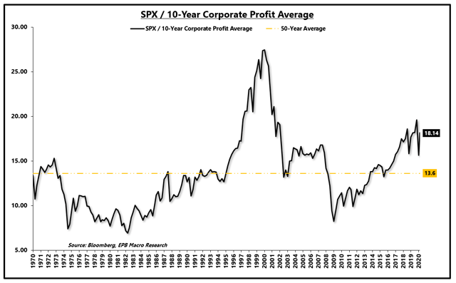
If we create a ratio of the S&P 500 to the 10-year average of pre-tax corporate profits, normalizing for tax changes over time and a standard market multiple, we can see that the market is still more expensive than any other period outside of the 1990s.
The 50-year average "multiple" based on this ratio is roughly 13.6x.
SPX / 10-Year Profit Average Normalized PE Ratio:
Source: Bloomberg, EPB Macro Research
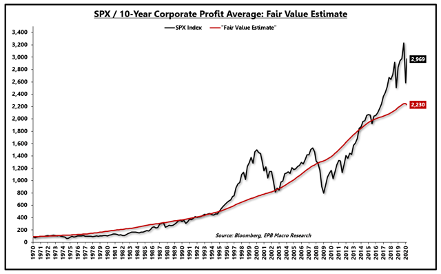
Using this "average" multiple, we can imply a "fair" value estimate for the S&P 500 over time, using true corporate profits from the NIPA.
This method arrives at a level of just above 2,200 for the S&P 500, about 25% below today's market level.
To reiterate, this does not mean that above 2,200 an investor should not participate and below 2,200 it is time to bet the farm. This exercise simply helps balance the level of risk in the economy with a long-term average value for the stock market relative to pre-tax corporate profits.
SPX / 10-Year Profit Average Normalized PE Ratio & "Fair Value" Estimate:
Source: Bloomberg, EPB Macro Research
Ironically, intra-day, the S&P 500 did trade into the 2,200 range, but as Warren Buffett noted in his annual conference, if you blinked, you missed it. This was unusual relative to past recessions as valuations stayed depressed for months.
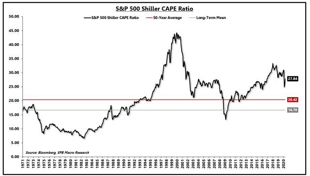
Another long-standing, reliable valuation measure, the Shiller PE ratio shows a long-term average multiple of roughly 16.7x. This ratio dates back to the late 1800s.
Using a more recent time period shows an average multiple of roughly 20x to be reasonable.
Today's market multiple, based on the Shiller PE is near 28.
Using the 50-year average multiple pegs an "average" valuation for the S&P 500 to be closer to 2,100, in line with the analysis above.
Shiller Cyclically Adjusted PE Ratio:
Source: Bloomberg, EPB Macro Research
Both long-term valuation measures above peg "fair value" for the S&P 500 in the range of 2,100 - 2,300. Again, these are not exact levels but rather ranges that help balance economic risk and market valuation.
The next valuation measure, however, shows that "fair value" may be closer to 2,800.
The broad market is likely using many assumptions baked into the model below, which may or may not prove true, but at the very least will offer reasoning behind the rebound in stock prices.
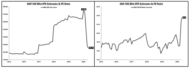
The chart below shows the current annual S&P 500 EPS from Bloomberg consensus sell-side estimates and the current PE ratio relative to those estimates.
Before the pandemic, consensus estimates for S&P 500 EPS were roughly $175. These estimates have been chopped down to a guess of $125. The market is undoubtedly trading at absurd PE levels relative to this new estimate but that is an unfair characterization.
S&P 500 Current EPS & PE Ratio:
Source: Bloomberg, EPB Macro Research
Eventually, the market will return to $175 in earnings power, so it is reasonable to discount 2020 and part of 2021 and start to think about earnings a year into the future.
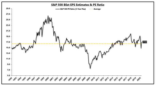
The valuation method below takes the PE ratio for the S&P 500 relative to the 5-year maximum in EPS estimates, $175 in the example above. So, relative to $175, the S&P 500 is trading at roughly 17x, nearly exactly the average since 1990.
S&P 500 PE Ratio 5-Year Max:
Source: Bloomberg, EPB Macro Research
Does this make sense? It does make sense if certain assumptions hold true.
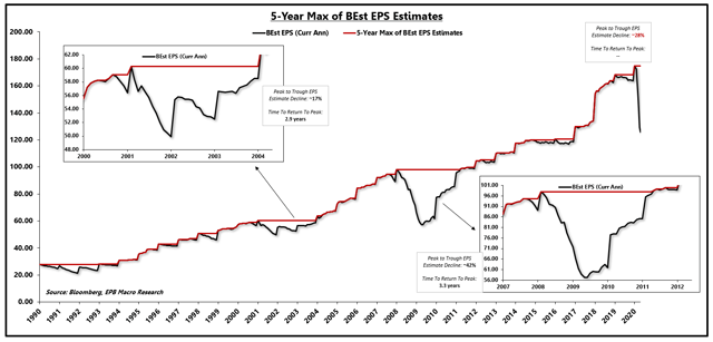
Graphed below is the S&P 500 consensus EPS estimates in black and the 5-year max in red.
The window on the upper left shows the 2000s recession period, and the window on the lower right shows the 2008 recession period.
During the 2000s recession, EPS estimates fell about 17% peak-to-trough and took 2.9 years to close the gap.
In the 2008 recession, EPS estimates declined by about 42% and took about 3.3 years to close the gap.
The current decline in EPS estimates sits at 28%.
S&P 500 EPS Estimates Peak-To-Trough:
Source: Bloomberg, EPB Macro Research
If the market is operating under the assumption that this recession will hold a similar pattern and the EPS gap will close in roughly three years, then it is fair to discount 2020 and 2021 earnings and start to price the market based on 2022 or 2023 EPS. The question becomes, is it realistic to assume that the market will close the EPS gap in the same three years? If so, the market "fair value" is closer to 2,850 based on the average PE multiple of ~16.5x relative to the 5-year max in EPS estimates.
Let's dig deeper to see if the market has a reasonable chance of closing the EPS gap in the same three years as past recessions by looking at the GDP output gap.
The Congressional Budget Office publishes a measure of "potential" GDP based on a variety of factors, including potential hours worked and total factor productivity.
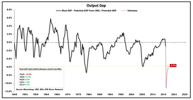
If we take reported real GDP and subtract it from potential GDP and express the difference as a percentage relative to potential GDP, we have the "output gap," or the gap between current GDP and long-run potential.
As the chart shows, recessions create a large output gap.
Using the optimistic assumptions from Bloomberg, denoted in the lower-left box, we can see that by the middle of 2021, even if these assumptions hold true, that the US economy will still be left with an output gap that matches the depths of the Great Recession.
US GDP Output Gap:
Source: Bloomberg, BEA, CBO, EPB Macro Research
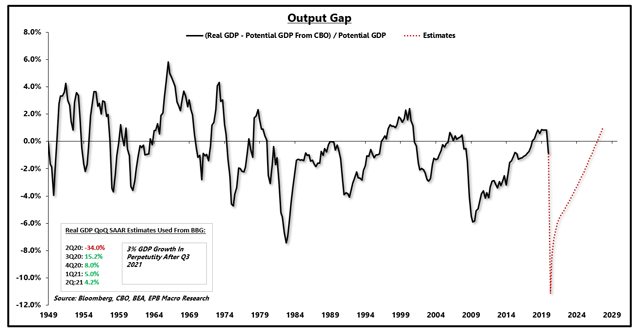
If we use the assumptions from Bloomberg through the middle of 2021 and then assume real GDP will grow by 3% in perpetuity, we calculate that the US economy will close the deflationary output gap by about 2027.
Closing The Output Gap:
Source: Bloomberg, BEA, CBO, EPB Macro Research
3% growth is clearly an unreasonable assumption given that the US economy did not generate one year of 3% GDP growth in this economic expansion.
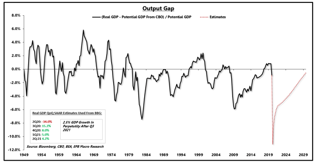
Even 2.5% growth in perpetuity after 2021 is unlikely, and that results in an output gap that lasts through 2029.
Closing The Output Gap:
Source: Bloomberg, BEA, CBO, EPB Macro Research
After the 2008 recession, it took about ten years to close the output gap, which makes another 10-year work-off period a reasonable assumption, if not longer given that 2.5% GDP growth is highly optimistic.
How did the earnings gap close in three years, however, if the GDP output gap took ten years?
Four main factors contributed to the earnings gap closing much faster than the GDP output gap, only one of which will likely hold true over the coming years.
First, margin expansion occurs after the depths of a recession, highlighted by the fourth chart in this note. Margin expansion will occur again in 2021 after likely reaching a trough in 2020, which will help profits grow faster than the economy for a period of time.
Secondly, share buybacks contributed to EPS growth, as the measures used are on a "per share" basis. Share buybacks are likely to be less robust coming out of this recovery, particularly because some of the government programs limit the use of share repurchases.
Third, corporate taxes as a percentage of total corporate profits have fallen dramatically. The chart below does not show the corporate tax rate, but rather corporate taxes paid as a percent of total corporate profits.
In 2007, corporate taxes were roughly 25% of total corporate profits. By 2011, when the EPS gap had closed, corporate taxes as a percent of total profits had fallen to roughly 16%. Given that corporate taxes paid as a percentage of total profits have already been slashed to record lows as a result of the new legislation and more relaxed treatment of corporate loopholes, it is unlikely that such a decline can be replicated again.
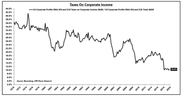
Corporate Income Taxes Paid As A % Of Corporate Profits:Source: Bloomberg, EPB Macro Research
The historical pattern from this chart is clear. After recessions, corporate taxes paid as a % of corporate profits steadily decline, helping close the EPS gap much quicker than the GDP output gap.
Furthermore, most recessions and declines in corporate profits are centered around manufacturing, which benefits from a pent-up demand rebound. While this recovery will undoubtedly experience some pent-up demand recovery, the outsized impact on the service sector is a new phenomenon that may challenge a "V" shaped rebound in EPS compared to past recessions.
The combination of less aggressive share buybacks, less ability to lower effective corporate tax rates, and a service-sector led recession will challenge the assumption that the earnings gap will close in a time period consistent with the last two recessions.
It is entirely possible that these assumptions do come true and in that case, the rebound and S&P 500 valuation are more logical around the 2,900 level. With a list of risks that spans multiple pages long, current valuations simply leave a low margin of safety for that outcome.
As valuations continue to rise, the model portfolio at EPB Macro Research will share in the gains, albeit at an underweight allocation of risk.
The model portfolio at EPB Macro Research will incrementally add more equity exposure and raise the weighted beta of the portfolio as valuations move closer towards "fair value" estimates that leave a larger margin of safety relative to the economic risks on the horizon.
If you understand the economic cycle, you can profit from the opportunities that emerge from its ebb and flow.
To learn more about our long-term, low-volatility model portfolio strategy for all markets, click the link below to try EPB Macro Research risk-free for 14 days.
You have nothing to lose by joining for free but if you learn how to navigate the economic cycle, it will change the way you invest forever.
"He has given me a valuable education and stabilized my investing life" - Morganek123
Click this link for a FREE TRIAL
Disclosure: I am/we are long SPY (UNDERWEIGHT ALLOCATION). I wrote this article myself, and it expresses my own opinions. I am not receiving compensation for it (other than from Seeking Alpha). I have no business relationship with any company whose stock is mentioned in this article.