Google Search testing fully card-based design on desktop web [Gallery]
by Kyle BradshawOne of the core aspects of Google’s Material Design, especially as of late, is the usage of “cards,” which help visually separate things in an app or page. Google has now begun testing a new UI for Google Search on the desktop that’s based almost entirely around Material Design cards.
On mobile, Google Search has long been using cards to separate your search results as well as to organize things like news stories and the knowledge graph. Meanwhile, on the desktop side of things, cards have seen more limited use, with only the knowledge graph and Google News using cards, while the rest of the page is divided only by blank space.
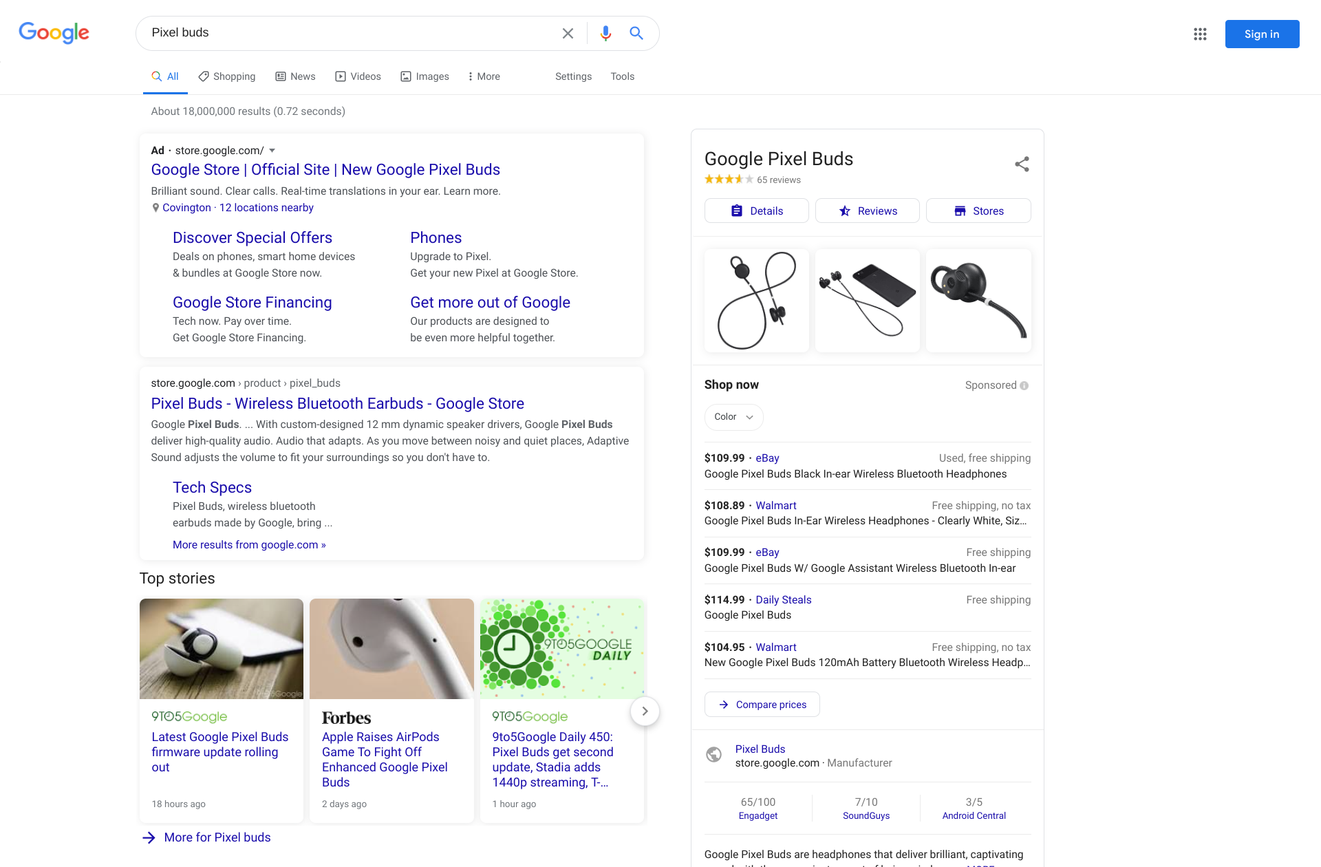
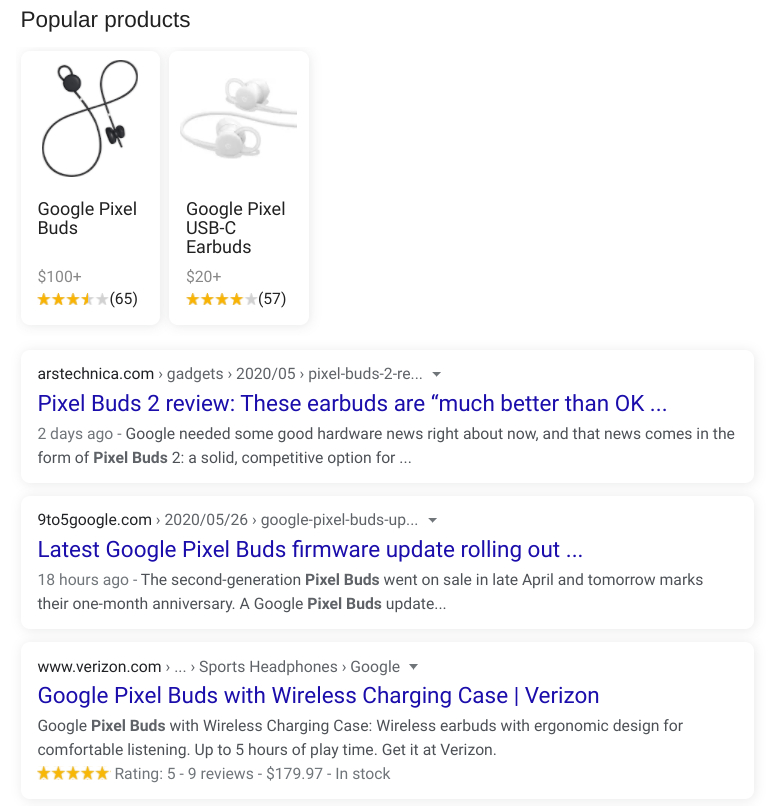
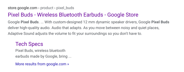
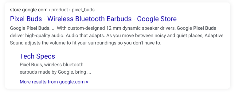
Today, we were spontaneously shown a different UI for Google Search on the desktop web, no doubt as part of Google’s many A/B tests. In the new UI, we see that every Google Search result has been placed into its own Material Design card. Additionally, unlike past uses of cards on desktop that have simply been flat to the page, this new experimental design includes a shadow effect to show that the card is “raised” above the rest of the page.


As you would expect, when a site has multiple results, they will be grouped together into one combined card, which is definitely much clearer to understand than the current method of simply indenting the extra results.


Interestingly, while most aspects are now based on these raised cards, Google Search’s knowledge graph and product comparisons UI still appear on flat cards. The other tabs of Google Search, such as News, Images, and Shopping, are all seemingly unchanged in the new design.
Reportedly, Google has tested this style of design at least once before, albeit back in 2016, years before Google introduced us to its newer, rounder Material Theming starting with the Gmail redesign.
For now, the test seems to be fairly limited, as we were only able to make it appear on one device and only in Incognito mode. As Google is testing an untold number of experimental UI changes at any given time, it’s hard to say whether or not this particular redesign will ever see a broader release. That said, I hope it does, as I am personally a fan of Material Design’s raised cards. Let us know what you think of this card-based redesign down in the comments!
More on Google Search:
- Google Search begins testing dark mode for mobile web, here’s how to try it [Gallery]
- YouTube for Android tests integrating Google results w/ video search
- Google Search adds 3D skeleton and other AR models, video recording on Android
Check out 9to5Google on YouTube for more news: