Review: The Fitbit Charge 4 could be good enough to toss your Wear OS watch in the trash
by Manuel VonauFor many people, Fitbit is synonymous with fitness trackers, but the company has faced new challenges from smartwatches in recent years. The Fitbit Charge 4 signifies a change, even if it doesn't look too different from its predecessor. The tracker packs everything you could want from a fitness tracker, and you get basic smartwatch capabilities like notification management, Spotify controls, NFC payments, alarms, and more. However, its $150 price tag may make it a tough sell when a smartwatch like Fitbit's own Versa 2 often goes on sale for the same price.
Specs
| Display | 1-inch 160x100 grayscale OLED |
| Sensors | 3-axis accelerometer Optical heart rate monitor GPS Vibration motor NFC Altimeter |
| Water Resistance | Up to 50 meters |
| Battery | Up to 7 days without GPS Up to 5h of continuous GPS |
| Dimensions | Body: 35.8mm l x 22.7mm w x 12.5mm h Small band: Fits wrist 140mm - 180mm in circumference Large band: Fits wrist 180mm - 220mm in circumference |
| Body color | Black or blue |
| Price | $150 |
The Good
| Battery life | Even with an always-active connection and notification mirroring, I got more than seven days of usage out of the device without GPS tracking. |
| Built-in GPS | Combined with the NFC payment service, the band makes it possible to stop by a bakery or café when you're out running without smartphone or wallet on you. |
| Tracking | Manual and automatic tracking seem on spot, though the latter sometimes fails to recognize exercises altogether — you might have to play the settings to make it more accurate. |
| Fitbit app | It lets you connect many third-party services and breaks down complicated health and fitness tips in easily digestible chunks. |
The Not So Good
| Display | While the necessity of a colored interface on a fitness band is debatable, competitors like the Garmin vívosport and the Xiaomi Mi Band 4 reach similar battery life with colored OLED displays and lower prices. |
| UI and navigation | It takes some time to get used to navigating the tracker's interface, and the animations are rather stuttery. At least the UI is otherwise fast and responsive. |
| Music controls | Why make them Spotify exclusive? Fitbit could've at least supported basics like pausing and skipping for any audio player, or even added local storage for music. |
| Charger | The claw is cumbersome and finicky. |
Design, hardware, what's in the box
The Charge 4 comes in three variants: black, Rosewood, and a Special Edition. The only difference is the color for the former two and the included woven band for the latter. No matter which model you choose, you get a small and a large variation of the band included in the box, so the tracker should comfortably fit on any wrist.

On the outside, the Charge 4 looks much like its predecessor. It has a one-inch 160x100 grayscale touch display with chunky bezels on each side and a Fitbit logo at the bottom. You could argue that other, cheaper bands have colored displays, but I don't think it's a necessity for a tracker. You'll find a pressure-sensitive surface that acts as a button on the left, indicated by an indentation. Vibration feedback gives you a sense of actually pressing something, though it doesn't compare with the iPhone 7's emulated home button. The back of the device gently curves to ensure the sensor array always touches your skin for correct heart rate readings. On my wrist, the Charge 4 is definitely among the lighter wearables, and I mostly forget it's there unless I interact with it, which is how it should be.
Unfortunately, the Charge 4 still relies on a two-pin connection for charging, just like its predecessors, which is a pain to use. You need to align the charger's claw perfectly and make sure the device really charges before you can leave it to itself.
Software, performance, and battery
If you've ever owned a Fitbit tracker, the interface will be familiar — the company isn't reinventing the wheel here. You can choose from an assortment of watch faces, but there are no customization options. A swipe down shows you notifications mirrored from your smartphone, a swipe up gives you an overview of your current stats, and a swipe to the left reveals "apps" like workouts, a Spotify remote, weather, timer, and settings. Holding the capacitive side button opens another menu for Fitbit Pay, sleep mode, and do not disturb. It's not the most intuitive interface, but it's fairly easy to navigate once you get the hang of it.

Fitbit uses the Charge 4 to introduce its Active Zone Minutes. They're basically the same as Google Fit's heart points, rewarding you for getting your heart pumping. Both are based on the American Heart Association and the WHO's recommendations. This system helps you put into perspective how well you do on a weekly and daily basis, and I feel it's much more useful than counting steps.


Left: Overview of automatic and manual tracking. Middle: Automatic tracking. Right: Manual tracking.
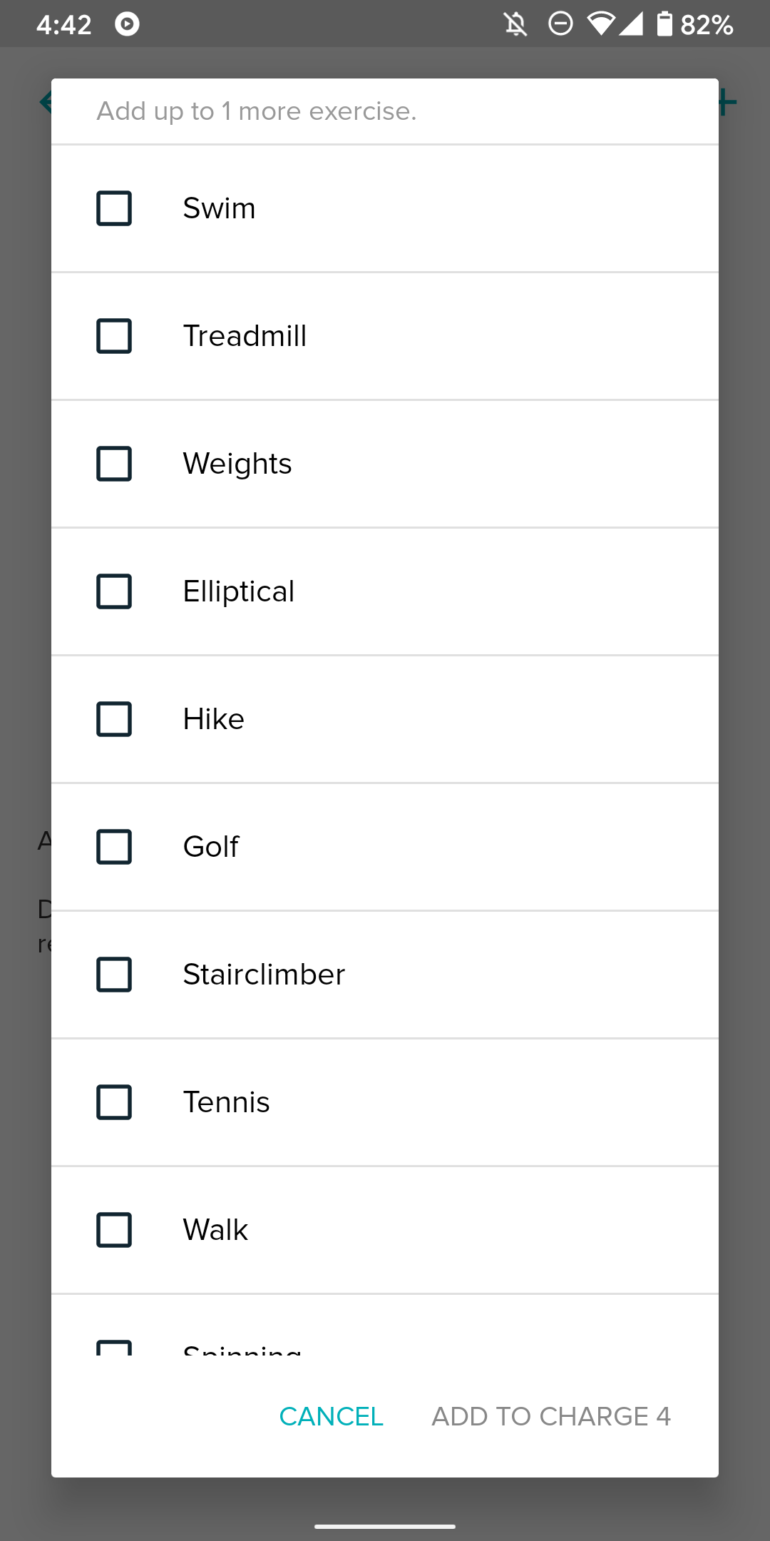
The automatic workout recognition has been hit or miss for me, especially for shorter bike rides or walks, but that's probably because the tracking only kicks in 15 minutes after you start an action by default, which you can change. If you don't want any automatic tracking to convolute your stats, you can turn them off for the device on the Fitbit website. Other than that, you can use the Fitbit app to customize which trainings you want to be able to manually activate via the band — there are a ton to choose from that aren't available on the Charge 4 by default, like HIIT or weightlifting.


You need to swipe away one of the standard workouts before you can add others to the Charge 4.
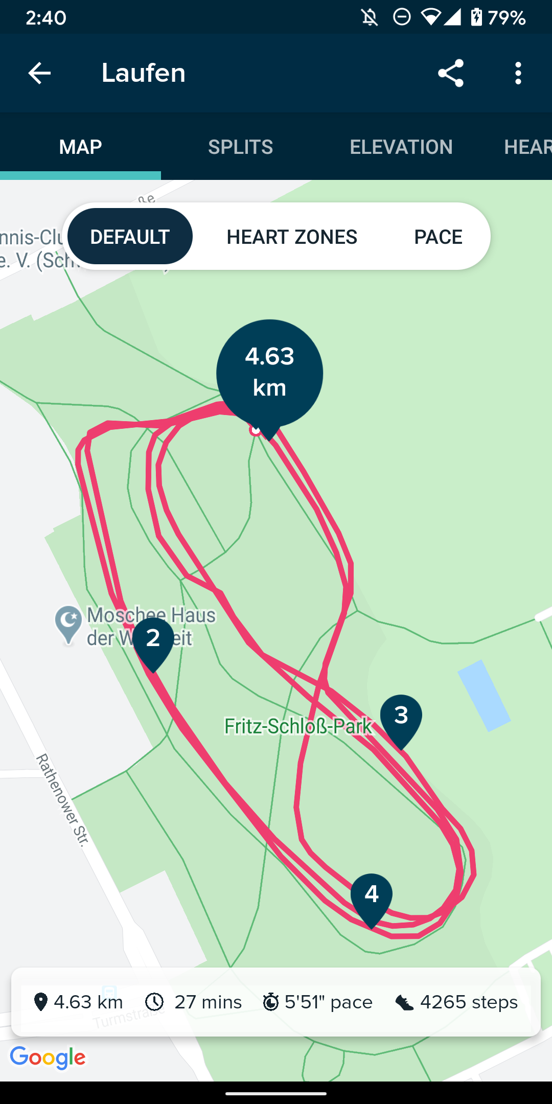
During some at-home quarantine workouts, Fitbit routinely told me that I burned about as many calories as indicated by the training app I've used, so I'm confident it tracks my activities accurately. The same is true for GPS — it almost perfectly traced the paths I've taken while running and biking. I can't speak for swim-tracking, though, since pools are closed at the moment. You might think that a device like the $30 Xiaomi Mi Band 4 is just as good at these things, minus onboard GPS, but when I used both bands in tandem, the Fitbit Charge consistently offered more accurate readings regarding distance.
Fitbit promises up to 5 hours of continuous GPS, which seems accurate judging from my rides and runs. When you don't use it, the Charge 4 easily reaches the promised seven days of battery life for me, and that's with raise-to-wake and 24/7 heart rate monitoring — I only turned off the former during the night using Sleep Mode.
App and features
Notification mirroring worked like a charm during my two-week-long test ride with the Charge. You can allow only some apps only or just give the go-ahead for all of them, and you can set up pre-defined message replies. It would be perfect if Fitbit would also respect Android's DND mode, but some people might like that phone and band settings aren't synced. At least I haven't experienced any of the dreaded connectivity issues many Fitbit devices were historically plagued with — let's hope the company fixed the issue for good with the Charge 4.

I appreciate that Fitbit included its payment service, but you need to protect it with a 4-digit PIN, which is cumbersome on the small screen. It's great as a backup when you're out running without your phone, but that won't come up if you like to listen to music while working out. The Charge 4's Spotify integration is only a remote — there's no way to download a few songs to your wristband. Other music services aren't supported, either. Fitbit could've easily tapped into Android's notifications to enable that, and even the $30 Xiaomi Mi Band 4 works with any application.


Tons of options and analysis in the Fitbit app.
The app is excellent, but it's a bit clunky and unintuitive at first. You have access to all of your stats in daily, weekly, and monthly overviews. You can also evaluate workouts down to the minute, track your sleep, and more. The app even gives you tips and encouragement on how to improve your health without being too pushy or annoying. You can also use it as a calorie counter and to keep track of your menstrual cycle. There's no native support for exchanging data with Google Fit, though, but at least there's a whole ecosystem of other supported third-party apps.


Charge 4 customization options.
The app also advertises its $10-a-month Premium tier for some extra sleep tracking features, wellness reports, and video courses, but thankfully the Charge 4 works fine without any of that.
Should you buy it?
Fitbit Charge 4
8/10
Yes, if you want a reliable, full-featured fitness tracker that also offering some advanced smartwatch features like solid notification management and NFC payments. There are some shortcomings like the charger and Spotify-only controls, and the price is a bit high at $150, especially with a device like the Versa 2 going for $200 (or much less at times). But if you prefer a light-weight, more classic fitness tracker over a full-blown, bulky smartwatch, the Charge 4 is the way to go. Of course, there's also Xiaomi's Mi Band 4 at the other end of the price spectrum, but I found it to be routinely less accurate when it comes to tracking.
Buy it if:
- You want an easy-to-use yet still comprehensive app to go with the device.
- You want something lighter than a regular smartwatch without losing too many features or accessory support.
Don't buy it if:
- You just want the most basic experience possible and don't care for Fitbit's app and third-party integrations — a Xiaomi Mi Band 4 might be for you.
- You prefer a more traditional smartwatch with proper apps and a watch-like form factor — you might like the Versa 2 or a Garmin Fēnix.