omg! ubuntu!
recent code commits intro a smarter, scalable apps screen
Hot Topic: GNOME Devs Make Major Improvements to the Apps Grid
by By Joey SneddonSome interesting things are happening upstream in GNOME Shell that affect the “Applications” screen, app folders, and the associated/underlying code.
Since GNOME 3.38 is on house to ship in Ubuntu 20.10 (barring any tradition-flattening calamities …Which, given how things are going atm, is a distinct possibility) these are changes which you and I, as Ubuntu users, will likely benefit from come October.
So what’s cooking?
GNOME 3.38 Apps Grid Tweaks
All of the changes mentioned in this post should be considered a work in progress and not guaranteed to ship in the final release.
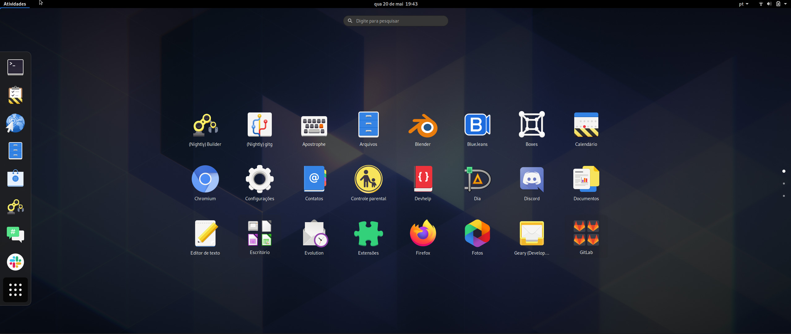
First up: the Applications screen drops the “Frequents” button that sira at the bottom of the grid. The apps grid is now just a single, vertically scrolling pane of application icons arranged in alphabetical order by default.
But what if you liked having your most frequently-used apps within easy reach? Why, allow me introduce you to the Ubuntu Dock 😉.
Secondly, the application screen is powered by a new layout manager. While this is a largely technical change (i.e. new code) it paves the way for both a more fluid and predictable end-user experience, plus a few new features.
For example, each ‘page’ in the launcher displays a fixed number of items — 24. The exact arrangement of rows and columns per page varies depending on the size of the screen in use.
So if you have a big screen you’ll see more icons in rows when you open the Applications screen, and if you have a dinky screen (shout out to fellow 11.6-inch lovers) you’ll see more icons in columns:

Margins above and below the actual “grid” area now appear more prominent. The size of app icons also scales to fit the available space. Might this mean an end to Half-hi… Applic… labe…? Let’s hope!
Finally, if you make heavy use of custom folders in GNOME Shell — a feature introduced in GNOME 3.34 — then there are (tentative) changes to look out for on that front too.
Like the main screen, app folders now adhere to a 3×3 grid and pick up support for app folder paging, as demoed in this video by Alex.
Wait— who?
Alex. You know: the BabyWogue guy on YouTube? The one who uses a robot voice over? Loves anime? C’mon, you know who I mean — the guy who obsessively stalks GNOME development like a spurned lover who hasn’t noticed? Yeah, him. 😉
Alex also demoes changes made from GNOME devs are revisiting the ability to reposition app icons and folders in the grid based on whatever random heuristic you’re aiming for. Put your favourite apps in the first row for easy access, perhaps?
I believe the plan is to support custom reordering in folders too, but don’t take it as read.
Are there any other application grid changes you’d like devs to add?