The Font That Solves The Big Problem With Dark Mode
by Barry Collins
A typeface designer has created a new font which it claims is the first in the world to solve a problem with dark mode - text appearing bigger than it actually is.
Dark mode - which normally presents white text on a grey/black background - has become commonplace in everything from operating systems, to apps to web browsers. Only this week, Google said it was testing a dark mode for its search results.
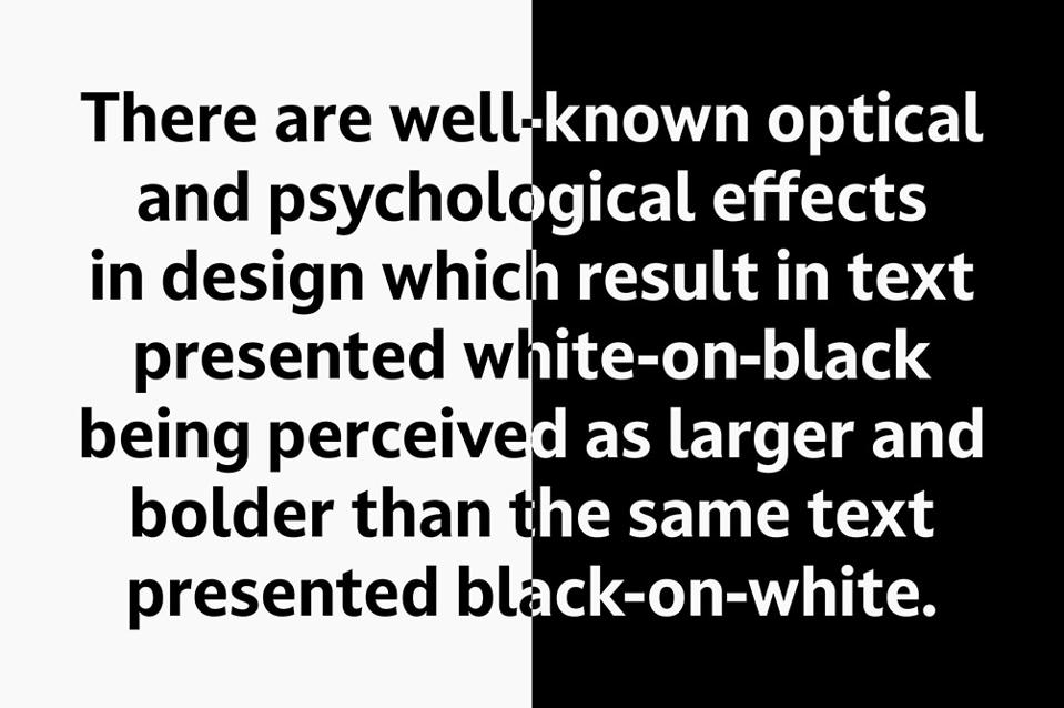
However, dark mode presents a problem for web and app designers, according to font foundry Dalton Maag. It claims there are “well-known optical and psychological effects in design which result in text presented white-on-black being perceived as larger and bolder than the same text presented black-on-white,” as illustrated in the image below.

“This presents a challenge for consistent visual hierarchy on different backgrounds, especially when designing for emissive displays [such as computer monitors and smartphone screens],” the company claims. “With more and more operating systems and devices offering a user-selectable ‘dark mode’, the issue is more prevalent than ever.”
Consequently, Dalton Maag has released its new Darkmode font, which offers two variants for each weight called DarkmodeOn and DarkmodeOff. The modes are designed to make the appearance of the two fonts look identical, even though there are subtle differences between the two. The DarkmodeOn variants are slightly skinnier than their DarkmodeOff counterparts, fooling the eye into thinking they are exactly the same when presented on the different backgrounds.
“The optical adjustment is surprisingly large, but is imperceptible to readers, aiming to help the designer properly present their intention while improving legibility and user experience,” Dalton Maag claims.
What’s more, the proportion and width of the fonts remain the same in the different modes, meaning designers won’t have to reflow text or adjust layouts depending on whether the user is in dark mode or not.
The company is offering a free trial of the Darkmode font - first spotted by Creative Bloq - from its website. Licenses for the eight individual font weights start at £17 ($21), or you can buy the entire family for £68 ($84).