
Behind the Scenes: Mordecai & Rigby
by Abby CrawfordIntroduction
Hi, I'm James, otherwise known as Rhen. I’ve been working with 3D for around 3 years. I mainly create still images, although I have dabbled in animation and game development in the past. For this particular project, I used Blender 2.79.7 (my computer hates 2.8x) and Gimp.
I thought of making something like this when I was racking my brain for ideas. I thought to myself, “Hey, wouldn’t it be cool if I made something from a cartoon?” and the idea was born. At the time I thought this would be a cakewalk. Little did I know there was much more work ahead of me than I had anticipated...
Modelling & Texturing 1: Mordecai
I’m actually fairly proud of Mordecai, and with his relatively short modelling time coupled with the fact that he’s somewhat faithful to the original character design, it’s hard not to be. If I knew what tragedies lay ahead of me, however, I would have been far warier going into this. At this point, I thought that since Mordecai was simple to model, Rigby would be too. I couldn’t comprehend that I, in my blind innocence, fell into a trap only true Blender masters could avoid.
Seriously though, my plan for this was to use a technique I started using about a year ago. I call it the anchor method. Basically what you do is model something simple, and If you’re proud of it, you ‘anchor’ yourself to it. That way if you ever get lost in a project you can always look back at that one model you created and get motivated to finish the scene.
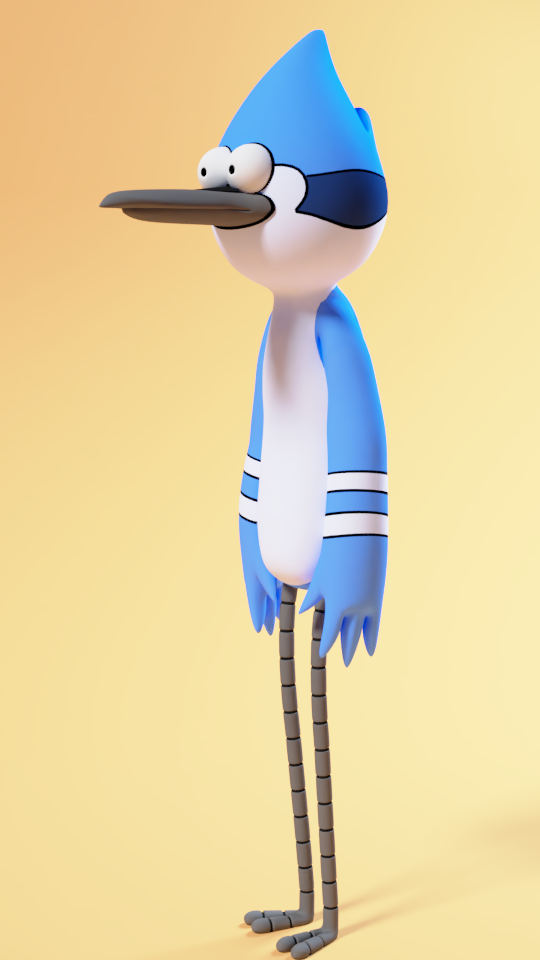

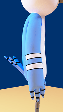

I started by gathering reference images of him facing both the front and the side views. After I had everything set up the way I wanted, I started blocking out his main forms. My mindset going into all this was to keep it simple and try not to overthink things. I don’t have much to show here because I didn’t record much from the modelling stage, so let’s skip forward to the semi-polished stage.
As far as the textures go, I definitely could’ve saved more time on them. Essentially what I did was I painted directly on the model. Doing it this way certainly isn’t the most efficient method, but it could’ve easily taken me longer if I didn’t have a graphics tablet.
After I finished with the texture map and the tail feathers, marking the end of Mordecai’s modelling, I could finally move on to Rigby.
Modelling & Texturing 2: Rigby & Environment
At last, we’ve arrived at the most difficult part of this project… Rigby. I legitimately almost gave up on this project because of this one model. Something I didn’t realise at first was that unlike Mordecai, Rigby doesn’t quite work in 3 dimensions. I tried to make it look recognizable from every angle like Mordecai, but it wasn’t looking right. If you want to know what it looked like, just imagine a bootleg version of Ty Coon from Deputy Dog. In the end, I decided I was just going to model it according to the camera angle.
I deleted nearly everything and started over. I modelled each of his limbs separately, but instead of joining them to the main model like I usually do, I decided to try something different. Excluding his torso, Everything you see on Rigby uses a fake connection to make it look like each piece is part of the main body. I did this by using the shrinkwrap modifier in conjunction with the data transfer modifier to fake a smooth transition between each object. Here are some videos to demonstrate:
As you can see, the scene pretty much stops being believable right when you look at it from a different angle.
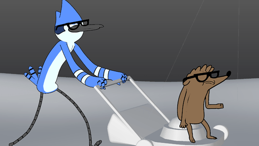

I actually had to start blocking out the scene while I was working on Rigby, just so that I could get the shadows right and make sure he fit well.
Lighting & Post-Processing
With the modelling and texturing coming to a close, it was time to work on lighting.
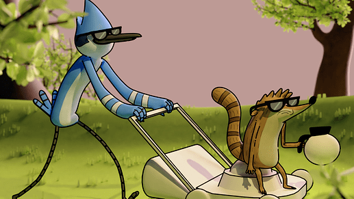

Now, this was in no way perfect, but it was my first attempt at trying to light this scene. I actually went through 3 versions in total, with one being scrapped because it looked even worse than this first one. The lighting I ended up going with was relatively simple compared to my other two attempts. In the end, I definitely could’ve added more lights, but I tried to keep it minimal to avoid overcomplicating things. Basically what I have is a spot lamp acting as a key light and a sun lamp to serve as a rim light. I made the background a cool purple color to complement the warm light coming from the spot lamp.


As far as post-processing goes, my workflow is essentially the same between each of my projects. I used Gimp for this project, mainly because Blender’s post-processing tools are lacking in terms of speed in comparison. One thing I like to do when editing is to look at a histogram and adjust its values accordingly. In addition to slight color grading and value tweaking, when I'm doing nature scenes I tend to add little bugs (fireflies?) and scatter them around the image. Whether it looks worse or not I can’t tell. Either way, here’s a comparison of both the edited and raw images:
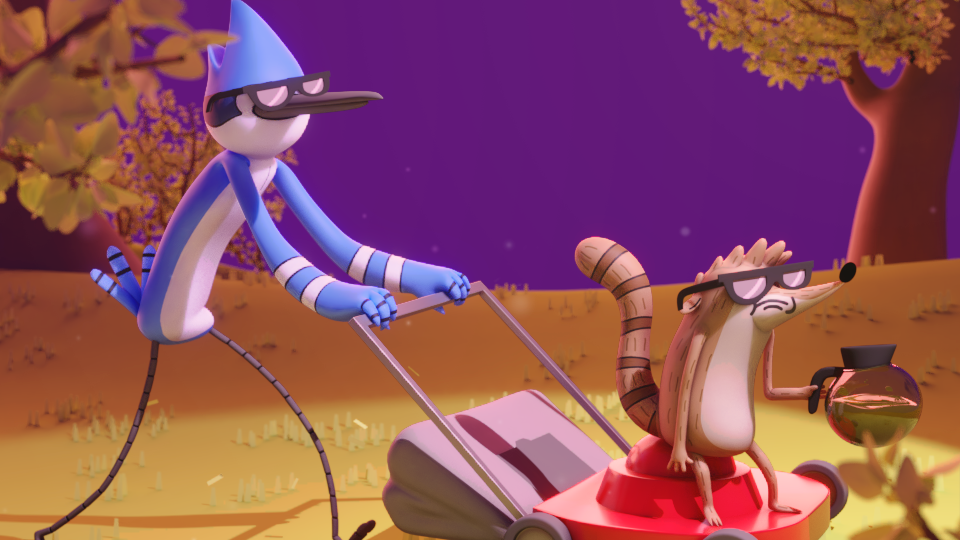

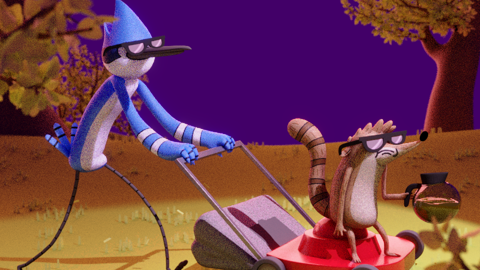

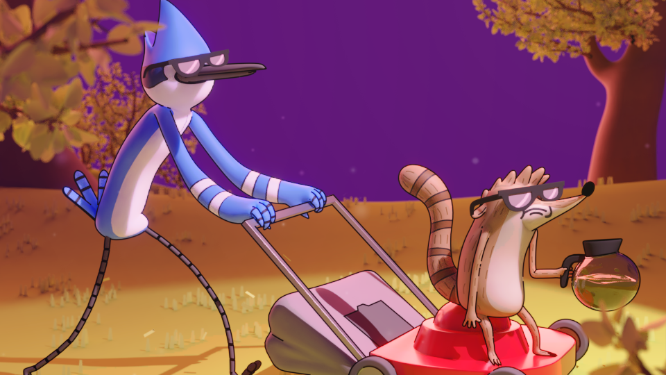
Ever since this project started I’ve been having an internal debate as to whether or not I should lean towards a more cartoony style or go full 3D. I decided early on that I wasn’t going to go for the full 2D look, and based my decisions off of that. Eventually, though, it got to the point where I had to choose whether or not I wanted to add outlines. I ran a poll on BlenderArtist to see what other people had to say. 50/50. I asked my family. Very close to 50/50. For a while, I didn’t know what to do, until I realised I was overthinking it and just posted both versions. What do you think? Outlines? No outlines?


Conclusion
All in all, this was a very fun project to work on. I learned a lot in the end, and I hope to improve in the future. If you’d like to see the thread I made detailing more of my process, click here. Thanks for reading!
About the Author

James Crawford, Self-taught 3D Generalist