Stop Hating Dark Mode Because It’s Different
by Sam RutherfordEarlier this week Google announced that the Google App was finally getting an official dark mode on Android and iOS, which is something that would normally make me happy, but I’ve suffered not one, but two rants from my colleagues complaining about dark mode. So consider this piece a direct rebuttal to my colleagues’ work so that I can go back to enjoying dark mode. I appreciate my colleagues and their opinions, but it also clear that those opinions are very, very wrong.
Let’s start with our interim editor-in-chief’s story last year. It practically crosses into conspiracy theory territory with its bad ideas. He acknowledges the benefits of dark mode UIs and apps, which include lower brightness resulting in less eye strain at night, improved battery life for mobile devices and a generally more pleasing aesthetic. Yet he concludes that the proliferation of dark mode is essentially a collective attempt at gaslighting people into thinking dark mode is better without any actual proof. He posits that dark mode is the “placebo of tech”, and that people who like dark mode things are suckers.
Then he goes on to cite how back in the '70s, '80s and '90s, computer screens used to have black backgrounds with white, amber or green text and that moving to white screens was this revolutionary change in digital design, when it was really just a simple move by programmers to mimic paper. This boils down to the question “If light text on dark backgrounds was so superior, why did we ever switch away?”
Not only does this premise ignore decades’ worth of display improvements when it comes to things like sharpness, resolution and more, it also doesn’t account any advancements in digital graphic design. Modern dark mode apps are not the same as unformatted text on 280 x 192 pixel screens. But more importantly, and this is something people who hate dark mode conveniently like to forget.
SCREENS AREN’T PAPER.
Unlike paper, screen emit light, which is important for you know, being able to read them in the dark (or even outdoors where modern screens can sometimes be easier to read than paper). And in 2020, it’s a somewhat ludicrous notion to argue that light mode is superior because it’s simply the current default design. That’s more or less saying dark mode is bad because I hate change and if I don’t like dark mode, neither should you, you mindless sheep.

At this point, it’s become generally accepted that blue light can impact your sleep patterns or circadian rhythms, with light mode being a bigger offender because to produce white light, a screen has to turn on every one its red, green and blue subpixels. But if you switch over to dark mode, you can complement the blue light filters built into many new devices shipping today by reducing your screen’s overall brightness, thereby reducing any impact on your nighttime activities.
Additionally, by switching to a dark mode app (or setting a device to use dark mode apps at night), you can help prevent a device from blasting your eyes with light if you happen to check your phone at night, which could jolt you out of your normal nighttime drowsiness or possibly disturb a nearby significant other.
Next, he brings up that people with astigmatism may have more difficulty reading light text on dark backgrounds, which is an important consideration. Yet, in contrast to people with astigmatism, people who have photophobia or are sensitive to light may be more prone to suffering from headaches and migraines after looking at bright screens, which is a symptom can may be partially addressed by switching to dark mode.

Furthermore, while black text on a white background may be more legible throughout the population, an older survey conducted at Stephen F. Austin State University in Texas shows that while yes, black-on-white is better, white-on-black isn’t far behind.
And when it comes to battery life, research firm Mobile Enerlytics found that switching to dark mode apps and UIs can reduce battery drain by 1.8 to 23.5 per cent or as much as 5.6 to 44.7 per cent on a phone set to 100 per cent brightness. That means, even if we cherry-pick, an energy savings on the low end of just five per cent would translate into around an extra 30 to 60 minutes of use depending on your phone. That’s an advantage I’ll take any day.
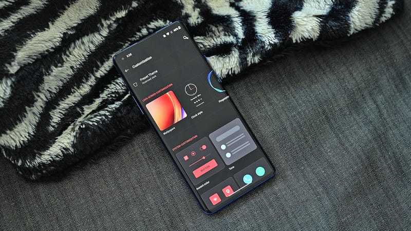
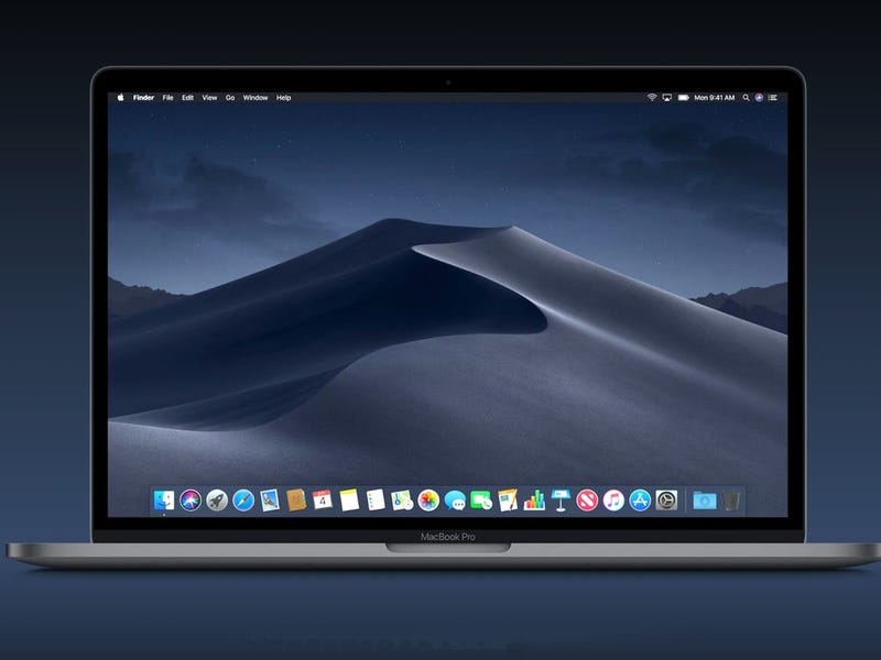
The caveat to all this is that you need a phone with an OLED screen, as OLED tech allows the phone to turn off subpixels when not needed. However, considering the number of gadgets that feature an OLED screen nowadays – which range from midrange handsets like the Pixel 3a to most high-end phones including the iPhone 11 Pro and Galaxy S20 and even a number of laptops – finding a device with an OLED display isn’t as hard as it once was.
As for Victoria’s unfortunate betrayal of dark mode, her experiences are simply a result of poor dark mode implementation in Slack, resulting in poor contrast for important notifications like new messages or various chat channels. As a fellow dark mode Slack user, I know she’s not wrong. Some things are harder to see! But it’s an isolated case, which means it’s unfair to decry all dark mode apps are worthless just because one app didn’t do it right.
If Andrew and Victoria wanted to be sensible, the best course of action would probably be to use “light mode” during the day and dark mode at night or in low-light environments like cinemas, or while playing games with the lights off, which is a personal favourite pastime of mine.
Finally, there’s the aesthetic angle, because, for me and a lot of other people out there, dark mode apps just look better. I love how apps with pure black backgrounds can blur the line between the edge of the screen and the bezel of a phone. I also really appreciate how system-wide dark themes are less obtrusive at night, as it feels like in some small way, I’m helping to cut back on light pollution, and as someone who likes watching videos before I go to bed, I sleep better too. Also, while science says this isn’t true for everyone, I find light text on dark backgrounds to be more readable that standard black-on-white, and it causes less eye strain to boot.
But regardless of which one you prefer, it feels strange to hate on dark mode simply because it’s different. One of the best things about technology is that it’s flexible and able to adjust to different people’s preferences, and after light mode has dominated gadgets for the last 30 or so years, I’m loving the addition of more dark mode apps and software to the gadget spectrum.
Featured photo: Sam Rutherford (Gizmodo)