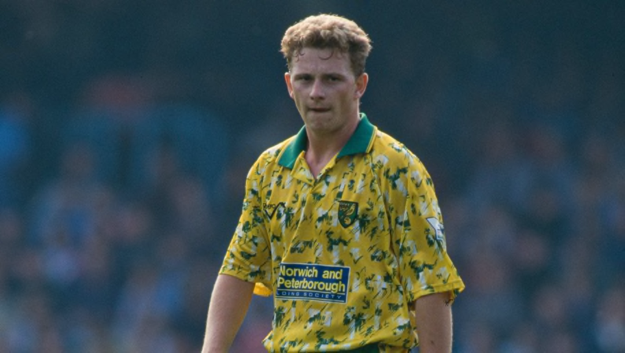
25 of the Wackiest Kits in Premier League History
by Ewan MurrayIt must be a difficult job churning out fresh and exciting football shirts every single season without straying from the ideals of a fanbase, or really being able to change anything really major like say... shirt colour.
As a result, many clubs produce pretty much the same old kit year after year, just moving the sponsor an inch lower or toggling on/off a collar to justify getting the fans to shell out.
It gets a little boring.
Therefore, we must stop to celebrate when kit manufacturers go off-piste, producing designs that looks as if they have been conjured up by a colour-blind, sleep-deprived impressionist painter.
Since the inception of the Premier League in 1992, in amongst the cookie-cutter templates, there have been a fair few of these retina-assaulting beautiful monstrosities.
Without further ado, let's take a gander at 25 of the wackiest kits in Premier League history.
1. Arsenal's Lighting Bolt Phase (1995/96)
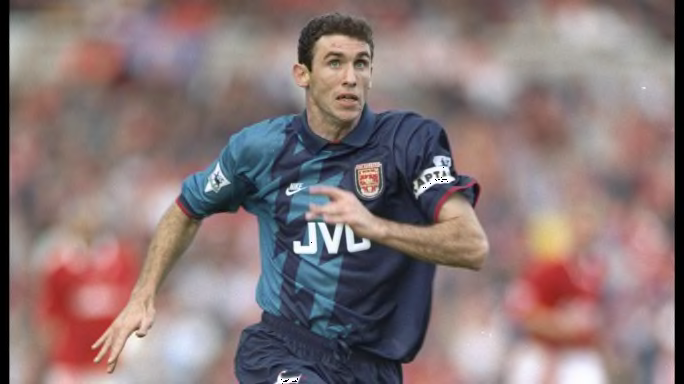
Nike, Arsenal and seemingly Thor conjured up this striking kit in 1995/96, continuing the lightning bolt theme that Arsenal had used the year prior. Love it or hate it, it's certainly memorable.
Why a lightning bolt? Why the hell not!
2. Nottingham Forest's Inky Kit (1995/97)
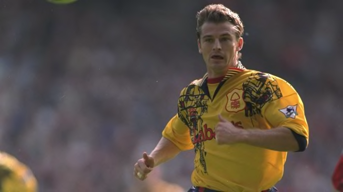
A halfway house between a toddler's doodles and a graffiti artist's inspired work, the black patterning on this lovely golden away shirt is certainly unique. It may not be to everyone's liking but we must celebrate the lunacy behind this kit.
Meanwhile, Forest fans can celebrate the days when they were actually a Premier League side.
3. Liverpool Try Stripes (2014/15)
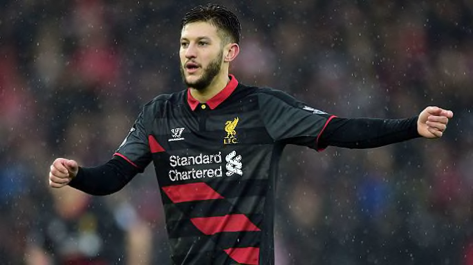
Sporting an eye-catching red sash and button-up collar, this shirt falls on the elegant side of wacky. Infrequently used by Liverpool as a third shirt in 2014/15, unfortunately we didn't get to see this unusual design on too many occasions.
Luckily, Warrior weren't finished with their quirky kits just yet.
4. Manchester United's Crazy Keeper Kit (1992/93)
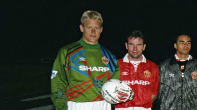
Fortunately for many of us, football kit designers often let loose when producing goalkeeper shirts. Perhaps because they'll only be worn by one player at any given time, they're often made with little to no restrictions, with plenty of colour and vibrancy thrown into the mix.
Reminiscent of Space Invaders, Peter Schmeichel was both lucky and unlucky enough to wear this kit in the early 1990s.
Ultimately, however, random geometric shapes emblazoned across a football shirt is still a winner.
5. Chelsea's Attempt to Make Grey & Orange Work (1994/96)
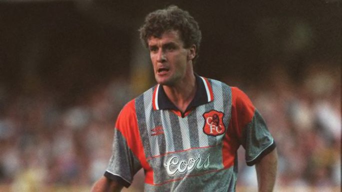
The old Chelsea badge in orange, grey vertical stripes that stop at the lovely Coors sponsor and a striking open neck collar...is it lunacy or genius?
Is there really a difference?
6. Norwich's Tribute to Jackson Pollock (1992/93)
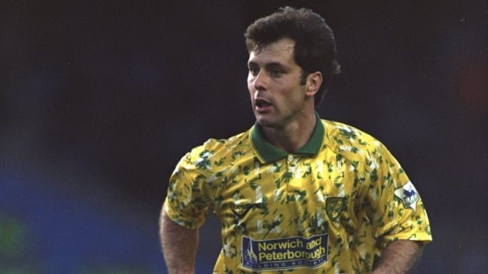
Not only did Norwich manage to finish a now unthinkable third in the Premier League in 1992/93, they did so sporting a kit that looked as if hundreds of Norfolk pigeons had unloaded their lunch on it.
I guess getting dumped on by a bird really is lucky.
7. Everton Join the Party (1994/96)
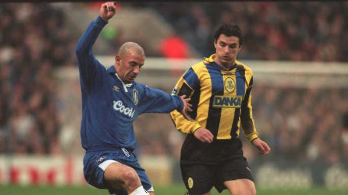
Despite being a staple of top-flight English football, Everton had rarely produced particularly noticeable kits. In 1994, that all changed.
Boasting bumblebee stripes with a dash of blue (because, y'know, they're Everton) this shirt certainly made up for lost time in the kit department.
8. Another Goalkeeping Beauty (1998/99)
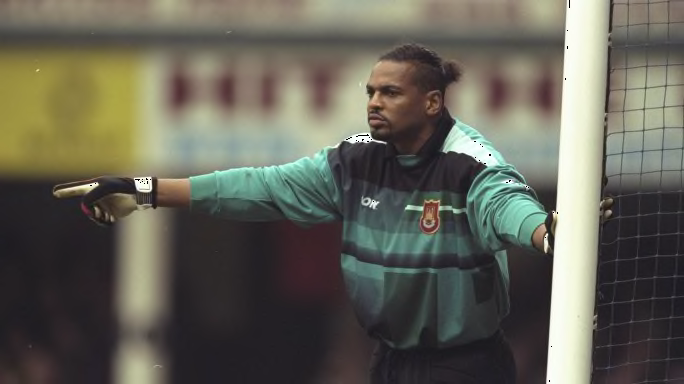
Picking up where Manchester United left off, West Ham went for a random shape theme for their goalkeeper shirt in 1998/99.
Consisting mainly of rectangles of various colours and sizes, Pony knocked it out of the park with this tribute to the bar graph.
9. Leeds Announce Themselves in the Premier League (1992/93)
There was no missing Leeds in the inaugural Premier League season, despite the side finishing just two points above the relegation places.
Admiral remain one of the most underrated kit manufacturers of the 1990s, producing this unashamedly drippy away kit for Leeds in 1992/93.
White, yellow and blue...could you get any more Leeds if you tried?
10. Manchester City's Ice Lolly (2019/20)
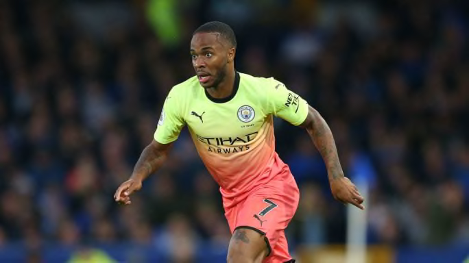
A yellow that isn't really yellow and a pink that's a little too pink, this ambitious effort from Puma has at least got people talking this season. This is definitely not the most beautiful kit on this list, but it does boast a colour combination seldom seen in the football world.
As far as kits that look like ice lollies go, it's the out-and-out winner.
11. Liverpool's Battenberg Design (1995/96)
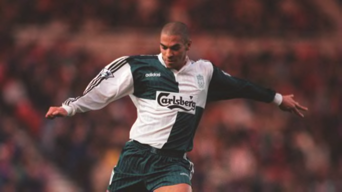
Reminiscent of some sort of strange green and white battenberg cake, this kit is an instant winner for one reason: it has different colour sleeves. There is nothing more eye-catching about football shirts than an asymmetrical design that is both satisfying and incredibly irritating to look at.
Plus, the spelled-out adidas logo cements it as a hipster classic.
12. Manchester United Embrace Being Manchester United (1992/93)
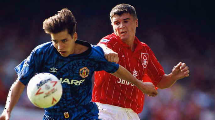
Considering that if you stare long enough at this shirt then your head will start spinning, it's hardly surprising that United won the Premier League title wearing this psychedelic kit.
As the wavy blue and black motif across the shirt was evidently not enough, the Red Devils stuck a massive Manchester United badge on the front of it.
If you've got it, flaunt it.
13. Coventry Channel Their Inner Norwich (1992/93)
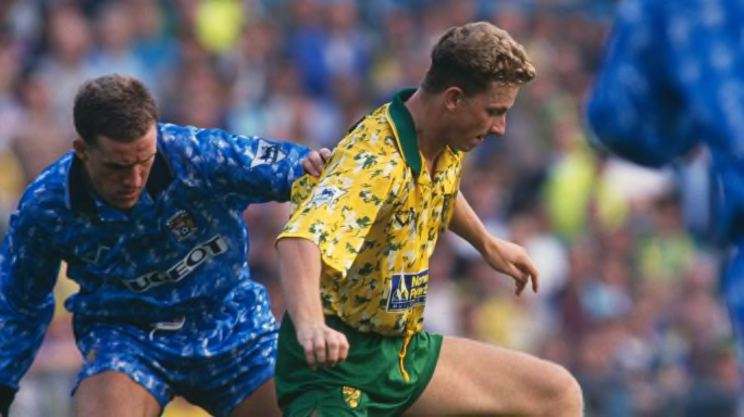
Considering Coventry and Norwich shared the same manufacturers in 1992/93 it's hardly surprising they both produced remarkably similar kits - although Coventry's attempt is a little less eye-catching.
While Norwich were inspired by their outlandish look finishing third in the league table, Coventry slumped to a disappointing 15th, avoiding relegation by just three points.
14. Liverpool and Warrior at it Again (2013/14)
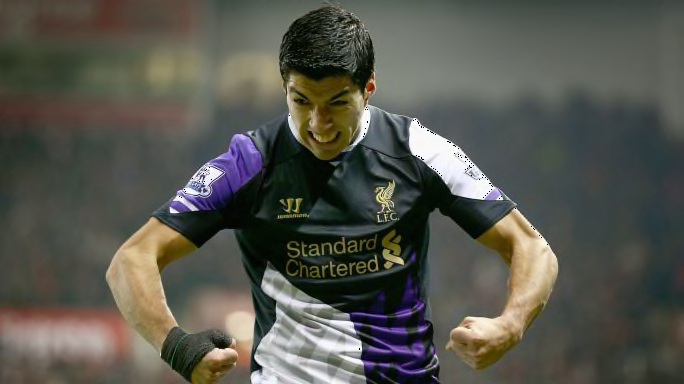
Liverpool's time with Warrior as kit manufacturer was far from perfect on and off the pitch, but you kind of have to respect the sheer audacity of the American sports brand.
Instead of playing it by the book, they ripped the book to shreds, set it on fire and danced around the flames.
A purple, white and black asymmetrical kit with zig-zag stripes and a gold sponsor - what's not to like? Well, lots but still...
15. Newcastle Brown Ale Strikes Again (1995/96)
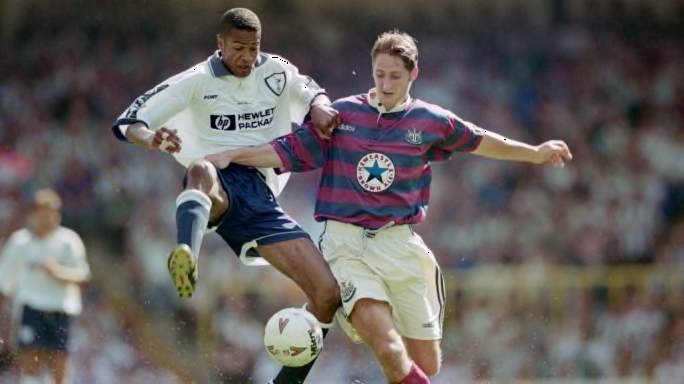
When the Magpies had Newcastle Brown Ale as their sponsors, the could do no wrong on the design front it seemed.
The home kit for Kevin Keegan's 'Entertainers' is oft-cited as the greatest of all Premier League kits but this redcurrant and navy horizontally striped away effort is just as iconic.
16. Liverpool Lose the Plot (1995/96)
Liverpool's 1995/96 goalkeeper shirt defies description. We're not quite sure what it is, or why it is what it is, but it's still breathtaking.
Let's just leave it there.
17. The Gianfranco Zola Years (1996/97)
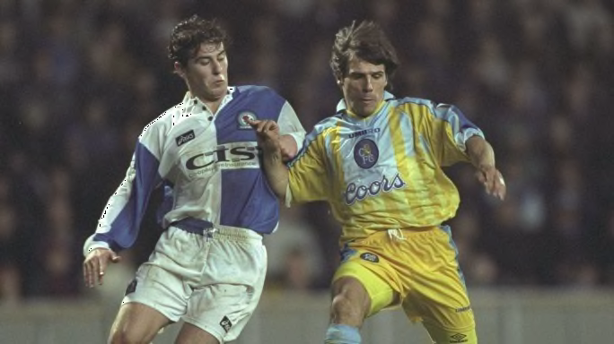
Whenever you lay eyes on this garish Chelsea away kit from 1996/97, only one player's name springs to mind: Gianfranco Zola. The little Italian could pull absolutely anything off, including a striking yellow and light blue combo.
With the kit manufacturer's logo and the Chelsea badge slap bang in the middle of the shirt as well, this jersey truly is a thing of beauty.
18. Sunderland's Pretty in Pink Kit (2016/17)
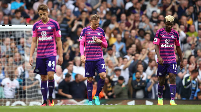
Pink kits often catch the eye - dividing opinion in the process - but this Sunderland third shirt was even more dazzling than most. The purple horizontal stripes add an extra dimension to this stunning shirt which unfortunately has a massive betting company sponsor right in the middle of it. Yuck.
Sunderland may have looked pretty in pink, but they weren't sitting pretty come the end of the season as they finished rock bottom of the Premier League table.
19. All Kinds of Blue (2002/04)
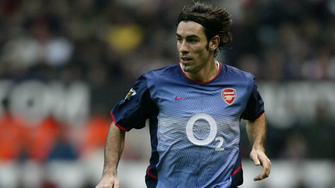
With every passing year, gradient kits like the one above seem to get less and less popular. Unfortunately, these are the turbulent times in which we live.
With 17 different shades of blue that you never knew existed, Arsenal's early 2000s away kit should be the inspiration for the return of the gradient kit.
20. The Kit That Couldn't Be Seen (1995/96)
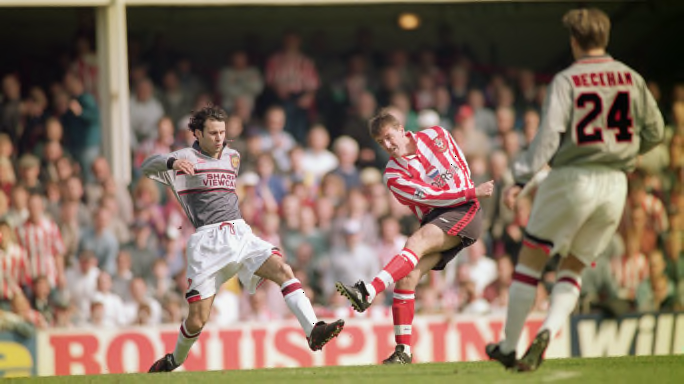
One essential of a football kit is that it's fairly visible to the human eye.
Considering United once had to change out of this kit at half-time during a clash with Southampton due to the fact that the players were struggling to see one another, this perhaps fails the fundamental test of any football kit.
Ignore that pretty important fact for a second and you'll see that this is a pretty interesting shirt. Made up of light and dark grey patterning - with the former looking like your mum's terrible cross-stitching - this is certainly one of the most different kits the Red Devils ever produced.
21. Man City's Sparkling Silver Kit (2000/01)
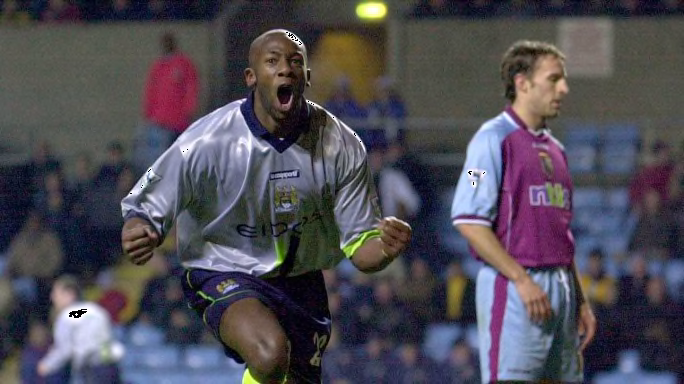
When you think of a silver football shirt, you'll probably think back to Barcelona's famous 1998/01 away shirt worn by the likes of Rivaldo. However, Man City had to settle for Shaun Wright-Phillips and co. back at the turn of the century.
Not only does this kit sparkle under the floodlights, it also has two striking lime green and blue stripes on the front, while also boasting a nice dark blue collar. Saucy.
22. Newcastle By the Sea (1993/95)
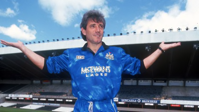
The term 'wavy' can very literally be applied to Newcastle's away shirt from 1993/95 with this stunner resembling the rolling waves of the British shoreline. The bright white McEwan's sponsor and the old school ASICS logo only add to this breathtaking jersey - modelled above by a dashing Keegan.
23. The Most Umbro of Umbro Football Shirts (1993/95)
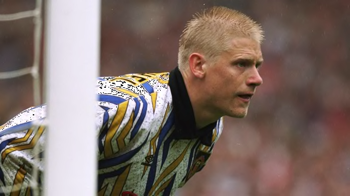
Peter Schmeichel must wake up most nights in a hot sweat thinking back to what Manchester United made him wear in the 1990s. Outlandish to say the least, this shirt has dissected Umbro logos in yellow and blue emblazoned across it, while also being a strange jumper-like material.
By the time 1993 came around, Schmeichel was already used to having all eyes on his wardrobe.
24. Manchester is Blue (1994/96)
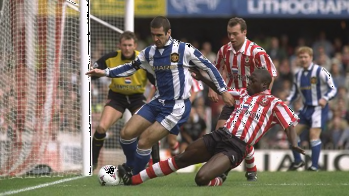
For a club that is so strongly associated with the colour red, United have had their fair share of blue kits over the years. This 1994/96 third strip is one of the finer examples with some lovely details and motifs that are noticeable on closer inspection.
More like the Blue Devils...amirite??
25. The Bruised Banana (1991/93)
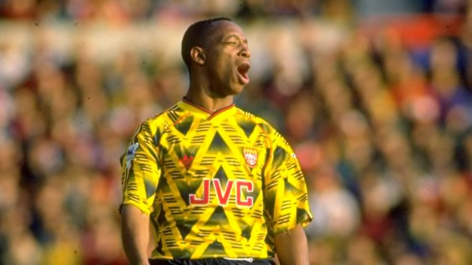
We thought we'd save the best until last with Arsenal's famous bruised banana kit - arguably the most sought-after Premier League shirt of all time, even prompting a re-release last year.
The Arsenal players might've worried that they were going to receive a few jeers from the crowd when they donned this cast-off from the Fresh Prince's wardrobe for the first time, but little did they know that it would become one of the most iconic kits in football history.