Spanish artists’ dreams of Arabia revealed
DUBAI: The Iraqi calligrapher Wissam Shawkat is sitting quietly at a cafe in Dubai, patiently explaining the intricacies of Arabic calligraphy.
“In Latin the letters are separated,” he says. “In Arabic the word is connected, so that creates a lot of ligatures and adds a layer of beauty to the script. One of the reasons Arabic calligraphy is beautiful is that kind of flow and connection.”
A combination of art, practice, patience and passion, calligraphy is at the heart of both Arab and Islamic identity. It is cherished for its beauty, clarity and harmony, and has been enhanced and developed over the course of a millennia.
Its origins lie in the preservation of the Qur’an, and the Islamic conquests of the 7th and 8th centuries CE, which spread both Islam and the Arabic language across North Africa and into the Iberian Peninsula. It would eventually flourish into its current system of discipline and elegance during the Islamic Golden Age.
“I think Arabs — or Muslims — look at calligraphy as an identity,” says Shawkat, who is drawn to the graphical element of calligraphy. “This is the one thing that is pure for us. This is the real thing.”
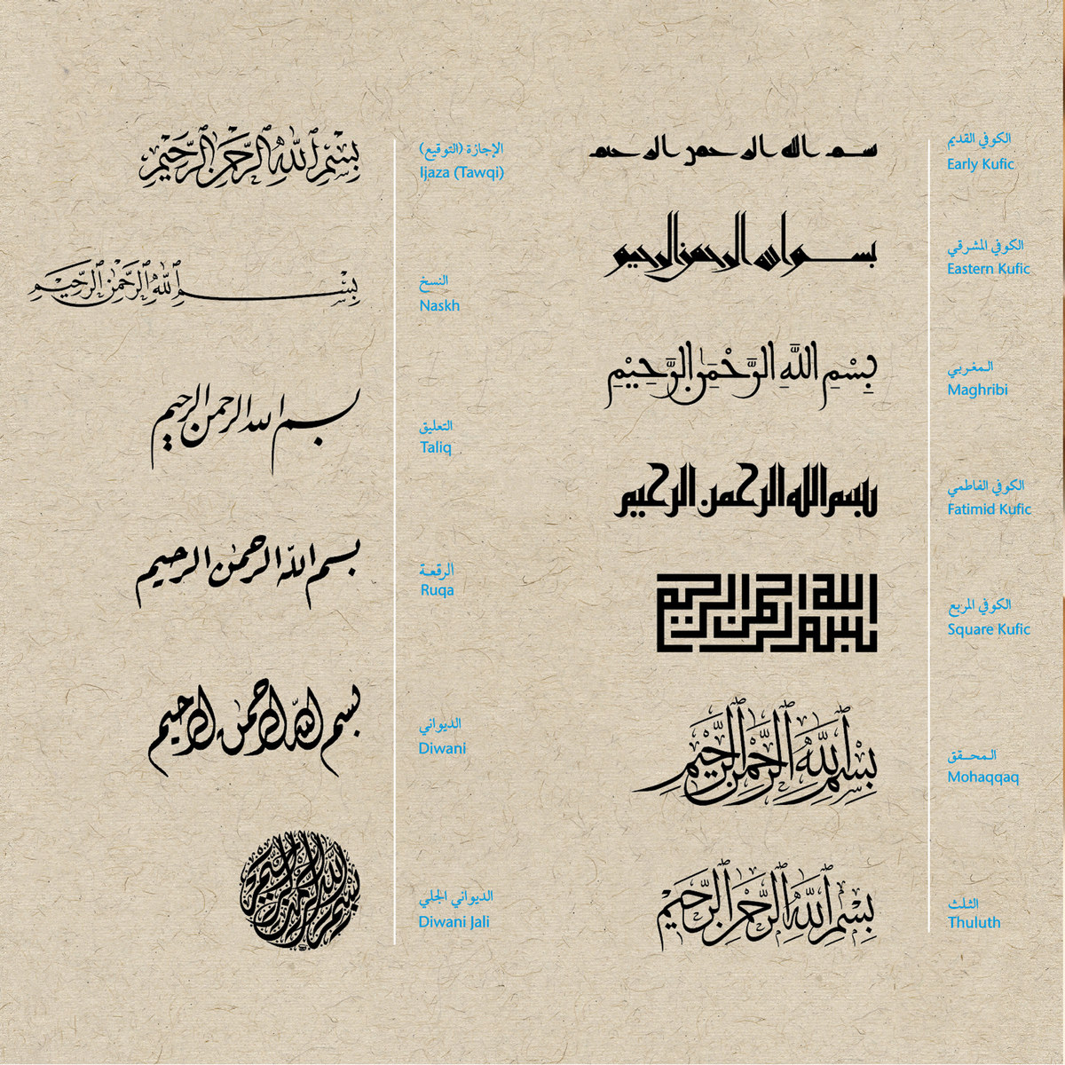
The art of Arabic calligraphy developed from two major styles: Naskh and Kufic. Originating in the Iraqi city of Kufa in or around the 7th century CE, Kufic is the earliest example of a universal calligraphic style. Defined by its long vertical lines, pronounced angularity and proportional measurements, it became the favored script for transcription of the Qur’an. Its geometric construction also meant it was particularly well suited to architectural decoration.

The art of Arabic calligraphy developed from two major styles: Naskh and Kufic. (Supplied)
Over time, other variations of Kufic emerged, with plaited, floriated and squared Kufic epitomizing the evolution of a calligraphic style. The style of any given script was primarily determined by how it would be used, with forms of floriated Kufic developed to adorn ceramics or architecture in the Fatimid era. Naskh — which is smaller and rounder — was a preferred script for administrative documents. Others, such as the heavily stylized Diwani, were developed for court correspondence during the Ottoman period to prevent forgery.
It was Ibn Muqla, an official of the Abbasid Caliphate, who codified the principles of calligraphy. Reflecting an association with the divine, the writing system he developed ensured the letters of any given script were in proportion with one another. This was achieved by establishing the rhomboid dot (created by the nib of a calligrapher’s qalam) and the length of the aleph (the first letter of the Arabic alphabet) as the units of measurement by which the size of all letters is calculated. This codified system still applies today and was applied to six calligraphic scripts: Naskh, Muhaqqaq, Rayhani, Thuluth, Ruqʿah and Tawqi. For example, the height of the aleph measures eight dots in Muhaqqaq, seven in Thuluth and six in Tawqi.
In the years and centuries following Ibn Muqla’s death his work was refined by Ibn Al-Bawwab and Yaqut Al-Musta’simi, both of whom spent the majority of their lives in Baghdad. The former produced an estimated 64 copies of the Qur’an, the most famous of which is now in the Chester Beatty Library in Dublin. Al-Musta’simi, who served as secretary to the last Abbasid caliph and survived the sacking of Baghdad by the Mongols in 1258, was the last of the great medieval calligraphers. It was he who replaced the straight-cut qalam with an oblique cut, resulting in a more refined and elegant script.
“After the Mogul invasion of Baghdad some of Yaqut Al-Musta’simi’s students moved to Iran and Turkey,” says Shawkat. “From student to student calligraphy was taught and learned and there was a calligrapher called Sheikh Hamdullah who is considered the father of the Turkish school. He’s the person who, I would say, took the work of Ibn Muqla, Ibn Al-Bawwab and Al-Musta’simi and started to enhance it.”
It was under the Ottomans that calligraphy reached its zenith, says Basma Hamdy, an Egyptian designer, educator and the author of “Khatt: Egypt’s Calligraphic Landscape.” They invented or perfected several styles, including Ruqʿah, with its straight lines and simple curves that evolved from quick handwriting, and Diwani, which was primarily used for court documents to ensure confidentiality.
“All these scripts really evolved during the Ottoman era and we, as calligraphers, when we look at the greatest examples of calligraphy, we look at these people,” says Shawkat, who works primarily with Thuluth and Jeli Diwani. “By the end of the 18th century or the beginning of the 19th century, that’s when, I would say, calligraphy stood still, because everyone believed, ‘This is it. This is the pinnacle.’”

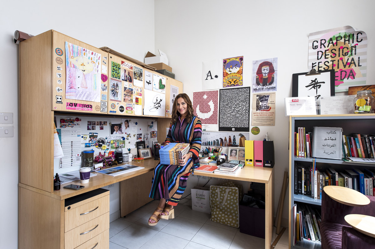
Basma Hamdy is an Egyptian designer, educator and the author of “Khatt: Egypt’s Calligraphic Landscape.” (Supplied)
Although the printing and the digitization of Arabic script led to a subsequent decline in the demand for beautifully rendered calligraphy, it remains central to Arab culture. It has been embraced by designers and architects, finding renewed expression in the calligraffiti of street artists such as eL Seed and Yazan Halwani, and modern art movements such as Hurufiyya. In Egypt, where calligraphy is an important part of the country’s visual culture — calligraphers have been responsible for the creation of signs, advertisements and movie posters since the early 1900s. Brands, too, are increasingly embracing calligraphy.
“I am happy to see calligraphy making a comeback in design, advertising and popular culture,” says Hamdy. “My only worry is the lack of awareness of its forms, such as proportions and its script grammar (correct formal positioning). I find that the nostalgia for particular forms of the Arabic script — such as Ruqʿah, a shorthand script often associated with Egyptian posters and ads — supersedes the need to be respectful of the proportions, rules, and guidelines that took centuries to perfect. I have often seen very poor examples of typefaces and fonts used in Arabic series, ads, conferences, et cetera. There needs to be more awareness of the importance of form and respect for the beauty of the script.”
This awareness of proportion and form is central to any debate regarding the modern or future use of Arabic calligraphy. Do you defend classical tradition and strictly adhere to form? Or is there room for modernization and the development of new scripts? Should calligraffiti — which has no rules and requires no formal training — even be talked about in the same breath as calligraphy? And where does modern lettering, with its experimental play and rule-breaking, fit into the debate?
“If you think about all the different styles of calligraphy, at a certain point in time these styles evolved and were considered revolutionary to the ones before them,” says Shawkat, who invented his own script, Al Wissam, in 2004. “If you really study calligraphy well and you understand how things evolve, you will be able to come up with something new. Everything should evolve. But to break the rules, master them first.
“I would like to see more traditional calligraphers open to the idea of the evolution of calligraphy,” he continues. “Do like I’m doing. Take a script, add to it, create a new form through your understanding of the past. Because this script that’s between your hands now arrived to you because someone did that job many years ago. They took it and evolved it and then you think ‘Ok, it reached perfection.’ But no. Nothing can reach perfection. There is room for evolution.”