Stop Trying To Clone The Apple Watch
by Victoria Song
At this point, there’s no denying the Apple Watch is the smartwatch to beat. It’s feature-rich, massively popular, and when you wear one, it confers a certain sensibility about you, the tech-savvy consumer. But for the love of everything holy, can other smartwatch makers please stop trying to shamelessly ape the design?
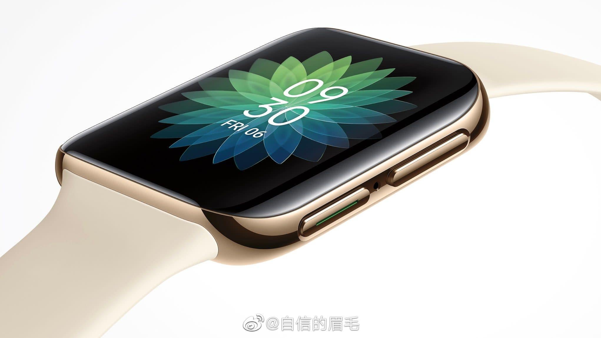
The latest offender, if rumours are to be believed, is Oppo. Renders of Oppo’s copycat smartwatch popped up on Weibo and Twitter and you don’t need to be a genius to see the resemblance. The only significant difference is the right-hand side of the watch features two buttons instead of a digital crown.
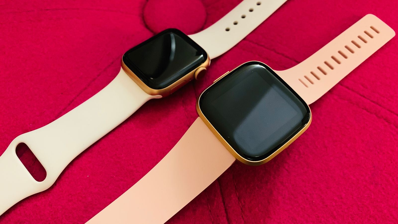
Of course, this is just a render—we’d have to wait to see if and when Oppo releases the smartwatch to see just how much it copies Apple’s design. That said, Oppo is not the only tech company doing this. Just a few short months ago Xiaomi released the Mi Watch, which surprise surprise, looks just like the Apple Watch down to the crown. Can you guess what the Amazfit Bip looks like? Meanwhile, at a glance, Fitbit’s Versa line also takes a cue from Apple. Many a time I’ve worn one out in the wild, only for someone to mistake it for an Apple Watch.
But this is bad for wearables as a whole—if only for the sole reason it stifles creativity. Watches are not a monolith. While many people are fine with the Apple Watch’s square face, there are plenty of readers who sound off in my comments and inbox about how it’s not for them aesthetically. Round watches are classic, and Samsung’s Galaxy watches are an excellent example of using that shape in a clever way via its rotating bezel. Honestly, it’s way more intuitive to navigate through screens by swiping a finger around the edge, than using the Apple Watch’s digital crown.
Speaking of, it’s not as if everything about the Apple Watch’s design is the best. The digital crown is the first thing that comes to mind. While it was initially meant to mimic the feel of traditional watches, it’s often more of a hindrance in everyday use. I happen to wear the Apple Watch on my left wrist, which means I often accidentally bump it if I’m wearing a big jacket.
If you’re not familiar with the Apple Watch, it means I’m constantly bringing up Siri when I don’t want to. Likewise, it was a bother when trying to track my boxing classes—I could feel the crown occasionally push up against my hand wraps inside my gloves and somehow that would stop my session. In general, raised pushers on smartwatches can be more annoying than helpful and it’d be great if smartwatch makers tried doing...literally anything else with them. (Case in point, even Apple has filed a patent exploring a ‘flat’ digital crown that can recognise gestures.)

I get that many Apple Watch knockoffs are meant to be cheaper smartwatches that get you the look and some of the features for a more affordable price. Heck, it’s one of the main reasons to get a Fitbit Versa! That said, there’s so much room to play with attractive and functional designs if all you want is basic activity tracking and notifications. The Fossil Hybrid HR isn’t as accurate and doesn’t do nearly as much as the Apple Watch, but it does the basics well.
It also kicks the Apple Watch’s arse in terms of battery life. Plus, I’d argue it’s much more stylish at a $US200 ($296) price point. Withings is another smartwatch maker with affordable, elegant watches. Sure, they might not be quite as advanced (though Withings did get functional ECG onto a hybrid analogue!). Then again, most of these knockoff watches aren’t either.
Apple is the watchmaker to beat—but a lot of that is because it’s simply the best at introducing advanced features, maintaining a robust app ecosystem, and figuring out clever ways for the watch to interact with other Apple devices. And yet, this is a watch limited to iOS users and a huge chunk of the world is on Android. It seems a wasted opportunity to just peddle Android-users—and anyone else who isn’t in love with the Apple watch design—a cheap lookalike that’s probably worse. If you can’t beat Apple on functionality, then the design should be the natural arena in which to set yourself apart.
As a wearables reviewer, it’s also getting dangerously boring as an increasing number of watches opt to just copy everything Apple does in this space. It’s disheartening to see all the new, exciting ideas come from just one company. So please, I’m begging every wearables company out there. Just do something different.
[BGR]