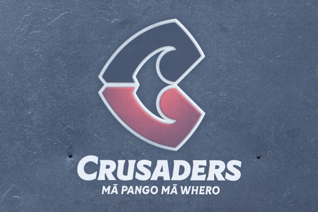
‘Two penises kissing passionately’ – Twitter hammers Crusaders’ logo fail
The franchise had to develop a new one after the mosque shootings in Christchurch earlier this year.
by Sport StaffThe new Crusaders logo is seen following a Crusaders Super Rugby Media Announcement at Rugby Park on November 29, 2019 in Christchurch, New Zealand. Following the Christchurch Mosque attacks, the Crusaders presented their new logo as part of a brand review. (Photo by Kai Schwoerer/Getty Images)
They might’ve set the benchmark for on-field excellence in Super Rugby, but the Crusaders won’t be winning prizes for logo design anytime soon.
The ten-time Super Rugby winners on Friday revealed their new badge, dropping the knight and sword symbol following a fierce debate over its appropriateness after March’s mosque shootings in Christchurch.
A brand review in mid-year prompted the revamp, given that the knight motif was felt to have linked the club to the medieval Crusades, wars between Christians and Muslims.
According to a statement by the franchise, the new logo represents The Tohu, “the natural landscape in the region, stretching from the top of the Southern Alps to the depths of our moana”.
However, according to some Twitter users, it looks more like “two semi-erect penises kissing each other”.
Other commentators were more diplomatic, with stuff.co.nz noting descriptions of “awkard” and “tokenised”.
“It looks a bit awkward, it doesn’t look refined,” said Dr Johnson Witehira, an artist with a doctorate in Māori visual art.
